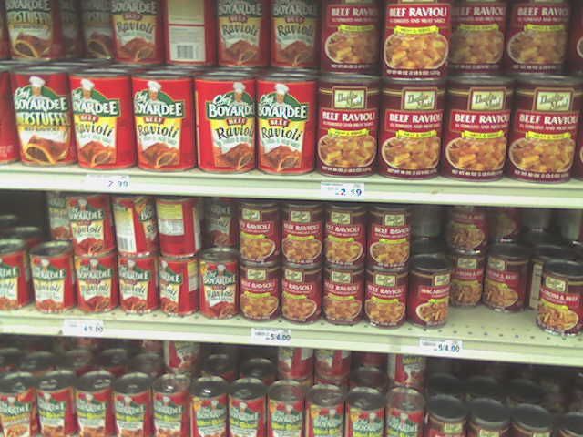
Well, to start off, again the type
used on the thrifty maid brand has DROP SHADOWS! There are three
different typefaces used on the can. The logo itself has a horrible
stroked outline. As for the picture, I am not to sure as to whether the
ravioli is supposed to be on a plate or bowl. As mentioned before in
another post, my can has a gradient too. Instead of the gradient
running from top to the bottom, they decided to put a dark maroon border at
the bottom of the can where the gradient gets the lightest. The border
covers up part of the picture. Plus the small type on the border is stroked in black. There are horrible inconsistencies here. Compared to the Chef Boyarde brand, which has that POP factor, this can should be beaten with a blunt object and sent to the scratch n' dent aisle. Chef Boyarde utilizes white in their design, and only has a single ravioli on as the image showing the plump beef inside. Thrifty maid could learn a thing or two from the Chef!
2 comments:
I totally understand...I had the same problem with my spaghetti. What is happening with the world?
That's some gross Ravioli, there! You're right, it's such a sad design especially sitting next to the Chef!
Post a Comment