Saturday, January 20, 2007


Winn-Dixie Dishwasher Gel Detergent

First off, the packaging was clearly designed to mimic that of Cascade, but very poorly done indeed. This picture, unfrtunately doesn't do justice to the horrid labeling as it continues on the back side.

On the front:
The word "Dishwasher" is in a bold blue gradient with an outline. There's an illustration of a wine glass floating in bright blue water and the background has a lime coloring to it. Oh, and I can't forget the Winn-Dixie logo that looks as if it was just slapped on at the last second.

On the back:
The same gross Dishwasher gradient thing. That big Winn-Dixie logo, as if you forgot before turning it around...and the type, there's so much of it cluttered together that I honestly, can't bear to read it. blah.

The whole design is boring...so boring in fact that I'm going to stop here before I fall asleep on my keyboard. *yawn*

Friday, January 19, 2007

Success

Before I arrived at this image, I considered drawing a trophy and an athelete standing on a podium, but rather than narrowing the idea down to that, I deceided to take the pose out of the context of sports and make it as universal as I possible could by making it about the feeling that people get when they accomplish something. When we succeed, we may win money, respect, fame, or sometimes just the knowledge that we've done something right, but the common part of all of these experiances is that feeling that you get inside. That's what I want to communicate with this.

Thursday, January 18, 2007

All Students

Week 3 is here.

You must email me to participate.
You also have to respond to the invitation.
You have no excuse.
If you have sent me an email, you have been sent an invitation.
If you haven't sent me an email, consult your syllabus for the address.
Participation scores are accumulating.

This week is your last chance to get straight with Tod.

Fruit Cocktail


The Winn-Dixie Brand is the green can on the top shelf. It's pretty boring compared to everything else. It's got the Thrifty Maid logo along with a non-appetizing photo of fruit incorporated on the bottom. Even though it's green, it's darker and dosen't really remind you of fruit. There are so many other colors they could have used: orange, yellow (which seems the most popular) or any other "happy and healthy" color. To me, the blue can sticks out the most because it's the only one. The white can sticks out as well. The yellow had too many other features on the packaging to really draw immidiate attention to itself, but the Thrifty Maid brand is by far the worst, as it is weak in every aspect of the packaging.

ATTENTION! LAYOUT DESIGN STUDENTS

Be Sure to BRING to NEXT CLASS [Jan 24]:
- T-SQUARE
- TRIANGLE
- GRAPHIC RULER [must have PICAs & POINTs]
- Non-PHOTO BLUE PENCIL
- BLACK PEN or MICRON
- 1/2 SHEET OF POSTER BOARD

You Must be Prepared to work.

That is all.

Wednesday, January 17, 2007

Package Design

I don’t know how intricate you can make a tuna can, but I think if a graphic designer gets their hands on this, they can do a much better job than what is there. The pale peach color reminds me of skin and when thinking of food, that is not what I’d like to be thinking about. The typeface is thick with a small serif, but I think it could definitely use some work. Compared to the StarKist cans of tuna, the Winn Dixie brand of tuna looks dull and nasty. In addition, I noticed that every can on the shelf is blue…except for the Bumble bee brand, which is white. Was there a meeting that all the tuna packaging designers got together for and discussed that all of their packages shall be blue and they shall all look exactly the same on the shelf? If so, they need a new president, because I think that makes every can look the same. The only thing that makes the StarKist can stand out more than the others is the sharp blue and the little illustration. Seriously, the Winn Dixie brand of tuna looks like a can of bandades or something…I can picture it saying “chunk light bandades.” That tan really needs to go.

beaver fish


the fishies say it all! i like the way the 1 fish is doing exactly what the title says, standing out. emphasizes the point in a great way. the colors catch your attention well. the layout of the information is well put so that you can easily read and see all the information you need to. overall it's a great layout and i like the colors

-tab

Tuesday, January 16, 2007

Graduating is Success


When I think of the word success, I find graduating to be a perfect example. It doesn't matter if it's graduating kindergarden or even college, to me, graduation means success. As a student, you have worked hard through all the obstacles and reached the end of that level of school. The end is really just the beginning. You get to continue on in your life, making more goals and doing what you would like to do. Success is a special reward worth waiting for.


Along with this drawing, I also considered a few other ideas. I was going to just draw a boy with a gold star lol. I also thought about drawing a picture of myself happy in my own design studio with artwork on the walls, maybe some awards. I'd finally get to do what I want to do in life. But being a spot illustration, I thought this would be more relevant to other people.

Week #1- success


According to dictionary.com, success is "the favorable or prosperous termination of attempts or endeavors." When I think of success, I think smiling faces, happiness, hands flying, people cheering, laughter, and movement. I figured that most people would think of money or a dollar sign to portray success, so I wanted to steer away from that. I guess people feel that you must have a lot of money to be successful. I think a very common signal that a person will do when they are applauding someone on their success is a thumbs up. Therefore, that is what I drew. I added a jagged edge for some movement to the piece.

Week 1 Success spot illustration

Photobucket - Video and Image HostingThis spot illustration is to represent success. I thought of many different ways to represent success and failure, and most of them had to do with money. Success means different things to different people so to me it meant success at school. Getting good grades is most important to me, more important than monetary success. I also wanted to do something different than everybody else and I figured most people would think of money for success and failure. Some of the other things I thought about doing was a man in a business suit celebrating with money in his hands, and for failure I was going to draw the same man but frowning and looking tired and disheveled with his suit un-tucked and "past due" bills in front of him. I chose to do the graded papers because I felt that it could relate to what failure and success means to me right now and it could also relate to everybody else.
Monday, January 15, 2007


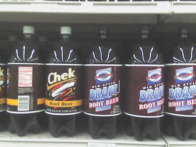
Holy Cow! I think I may have figured out how to post a picture!! hopefully this works! This picture should be my Check vs. the crappy rootbeer label.
Considering that this photo shows two "generic" brands of rootbeer on the shelf, Chek's Rootbeer is more well known. However, the horribly designed Winn Dixie brand rootbeer makes the "generic" Chek rootbeer look like a name brand product. The Crap Brand, as it shall be named, lacks a "logo", if the white circular blob is supposed to be that, well it needs to be redesigned. It lacks the "POP!!" factor that the Chek brand has. Poor use of color and layout for the graphical elements also helps to deem this brand as CRAP. The typeface is set in all caps, which as we all know is hard to read. While walking down the aile it could be known that Chek and other rootbeers are in fact- rootbeers. This brand, because of the horribly stroked outlines and all caps, looked more like a bottle of "old style" motor oil than something that I would want to drink!
(Well, I hope this is kind of the response you were looking for in this blog, if there needs to more let me know!
--Ryan Smyser
P.S. LEAVE ME COMMENTS!!! YAAAY!!!! LOL!!

Wonder-s of sliced bread packaging


I chose to analyze "sliced bread" packaging as this weeks product. Sliced bread products tend to be "me too" products. This is why the packaging design for each brand is very important. Aside from minor differences in slice size and texture white bread products are pretty much the same at point of purchase; yet some are priced higher than others. The basis for sliced bread packaging relies mainly on color and type treatment, being that the structural packaging is greatly similar in design. The packaging design is consistently made from a soft plastic, narrow, horizontal bag which is sealed with a twist-tie band at the base if the opening.
The packaging for sliced bread products are to say the least boring, inconvenient and played out. This design has been around for as far as I can remember and beyond. The long horizontal setup is not convenient for home kitchen storage possibilities. Bread loafs if not in bread boxes tend to take up valuable counter space, laying where ever they may, or for some people unaffordable shelf room in their refrigerator.
Though the packaging is similar the print design for each brand compensates. On shelf (point of sale) the white packaging stands out the most. It reflects the florescent lighting of the supermarkets they are sold in and gives the bread a longer lifespan providing greater protection against mold. Being that the rear panel of the bread is the first thing seen on the shelf at P.O.S type treatment and logos differentiate the brands from one another. The greatest success with this goes to the "Wonder" bread brand. There uses a very bright and colorful design with large, clearly read, bold lettering. Which is easily recognizable from a distance. Even if displayed on the bottom self in the bread isle the Wonder bread packaging clearly stands out. Their packaging is clean, simple, timeless, and successful.