Saturday, February 10, 2007

Dove


I got this in the mail. It was filled with samples of the Dove Nighttime product. The color on the box is really nice. An ultra-dark blue, so the shine on the product shots really stands out. The little gold dove symbols really stick out as well. You’d expect them to be silver but the gold accent really warms it up and keeps it from being to cold. I love the little accent stars and that random gradient swoosh by the type. Its placement gives the eye direction down to the product

Method


They sell this stuff mostly at Target. The left is dish soap and the right is the foaming hand wash. Industrial designer Karim Rashid designs the bottles. He’s done other stuff for Target as well and that funky plastic trash can. If you saw it you’d know it. They have other hand soaps and stuff as well and all the bottles are awesome. Even better they all stand out because the designs are so different than all the other products.


Apple Jacks


Apple Jacks sticks out, along with the Eggo brand in bright yellow. It looks as if companies have figured out that the brighter the color the more kids want it. The brighter ones are also lower, so kids can reach them on the shelf. Tricky Tricky. The Winn Dixie brand, Apple Wheels, includes red, and while it makes it look different than the name brand, it doesn’t look as appetizing.

Friday, February 9, 2007

commute


this my post for commute..when i think of commuting i think of someone driving across a freeway to get somewhere

transportation


this is my post for transportation..i thought of the travelocity commercial with the plane flying over the u.s. map

failure


this is my post for failure..this is a baseball player missing a catch..i thought this would be somethin that was easy to identify

success


this is my thought of success..somebody graduating

hunger


this was my illustration for hunger..i decieded to do a plate,fork,knife and spoon with nothing on the plate. this might make u think of hunger

thirst


this my post for thirst..i thought a empty cup with ice would make someone thisty

life


this was my illustration for life..i thoought of a small baby in a basket or somethin similair

this is my post of death..i thought of a tombstone when i was givin the assignment

this my post of fear..i thought of somebody scared

Thursday, February 8, 2007

Conceptual Imagery - FEAR AND RAGE week 4


Fear to me right away reminded me of the really cheesy movie called Scream. It's always the hot chick running away from the masked killer that cracks me up. It's lame and overdone. What's worse is they made 3 of these movies each making gradually less money in the box office. The second image is rage which definitely reminds me of the steroid infested testosterone driven environment in the gym. There is definitely alot of rage in workouts and the intensity is through the roof. Also notorious is the extreme roid rage effect when working out. I made sure to illustrate that very accurate in the image i drew. The veins in the forehead and just the shear emotion in the extremity of the workout i made sure to show. Hope you like and get a laugh or two!

Blind as a bat

Wednesday, February 7, 2007

this is my post for rage; i thought about doing an animal or some type of beast with a bad attitude.

this is my post for rage; i thought about doing an animal or some type of beast with a bad attitude.

Tuesday, February 6, 2007

Rapid-Vis Bear Down


While it's not exactly fair to blame Rex alone for Sunday, he was awful.

Bear Down, Chicago Bears...sigh...

Fear and Rage


First, I feel that this illustration of fear represents what ever fear does to us. Fear makes us want to cower and take cover. My fear is the dark and this is exactly what I want to do when I'm scared. The boy cowers in the room and the hint of light shows perhaps a door opening opposite him and he peeks through his arm. Real fear can be read on his face.

Rage makes my face hurt and I wanted to illustrate the pain in the face. Rage for some can be painful and here the man is clearly raging and it shows in the stress of his face. He screams in anger and pain.

Layout Design Week5


Kids, we're going on a vacation! Why? Because we need to use the elevator but it's all the way in China...literally.
Whoever wrote that sign, was a moron. How would you feel standing next to a pillar by an escalator at Dillards telling you there is an elevator conveniently located in China. Haha...
Then again it was in Omaha, Nebraska....
...silly midwesterns
-miss tabitha

Monday, February 5, 2007


I just wanted to show this picture of the peanut oil it gets lost in the sea of oils. I think that using the colors of orange and yellow with actually showing the oil, I think that the color pallette should be changed and the design worked a little better.

conceptual imagery week #4


I attempted to communicate the fear of one's own shadow and the dark. I remember as a child, I was paranoid of the dark. If I had to be in it, I would run through it, yet I would always feel like the dark followed me, like my own shadow. I would run outside to get toys left on the lawn or run outside to throw the trash away because I was scared of the dark. The dark is unknown and scary.

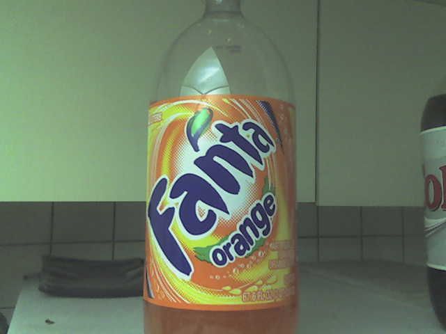
WANNA FANTA?


AH, FANTA! Well, I do not drink soda and I would not buy this cr*p :) even if it was the last thing to drink on the planet (this is my roommates junk). The package design for this beverage is way too overwhelming for me. Too much sun bursting and crazy type that's too busy. I understand it's Orange soda, but they could have used another color besides completely using orange! I can tell its orange just from seeing the soda through the bottle. I also don't like how the fanta is placed on the bottle, it makes you read it the wrong way, very uncomfortable. I have seen much better designs from generic orange sodas then this one. Their choice for a typeface is daunting as well, very bloated looking.

Sunday, February 4, 2007

Week 4


For Week 4 I found this Kleenex box that depicts a old world map on it’s

packaging. This packaging isn’t necessarily the most revolutionary in it’s construction;

however, I really like the idea behind the graphics. It could become an entire line of

kleenex boxes that every season or month or holiday had a theme. Because as

miniscule as it seems a kleenex box can stand out like sore thumb in room that is nicely

decorated. It also alleviates those tacky crocheted kleenex box covers that people use

to attempt to conceal the ugly boxes that they come in. These boxes could really take

off as a simple design element around a room if that consumer had a selection in color

or theme for them. They remind me of the new designs that you see on objects that

you would have never imagined that would be design elements around your home;

such as hand vacs, toasters, and coffee makers.

Package Design Good Packaging Example WEEK 4


The product i want to post on which was a great standout package design (in my opinion) was in the cat food section. No, i don't eat it it's for my cat in case you were wondering.. It's the wet food and also the dry food. The pciture i will post is for the dry food. Simply put it completely caught my eye when i walked into the section and immediately i could recognize it. I don't usually do this sort of shopping but i still found the product quickly and ended up buying it.
Packaging is a very bright yellow and even the wet food next to it matches nicely. It's almost TOO BRIGHT and eye catching but then again it works. Every different flavor and such is color coded and well labeled the way it sits on the shelf. Input is gladly accepted!
-Sean