Tuesday, December 11, 2007
CinemaSlave
Funkadelic

I'm all about this kind of design, I wish everything in the media business has a little FUNK in it!

DVD Packaging

crazy floor

I think this floor would be a great addition to a party. I can't really imagine coming home and seeing it every night, because it is a little obnoxious. But it definately has an interesting form and I think the concept is unique and interesting.
Form and Space

What caught my attention about this piece is that I tried to do something with this shape in this Form and Space class. With a dolphin in mind I created a tale format made of fome. Maybe the artist Ynagi had the same inspiration of a dolphin or a whale. It is lithe the tale of the fish is hanging out of the water. This object itself I do not know what it is. It could be a table or a chair. The edges of this object are also very smooth like a whale skin would be. I like the way shapes play light and also the use of negative space in the middle.
Monday, December 10, 2007


Lay Out design, with a Interior touch

This is a great combination of interior design and color harmony. This piece has great coordination and nothing sticks out in the picture. It all has a smooth warm look.
form & space.....
anywho, I shall explain in full detail of what the image is..
There is a base present in the object.. a pole/stick roughly about 5 inches long... the stick has a rubber substance around it. After 5 inches the stick meets up with a medal-ness... not sure what the medal is for.. but okay. (the medal is about... 1 inch long. and gold plated).
the end of the 1 inch medal thing (that surly has an undefined purpose) connects to a roung medal (gold platted) circle... with glass on the inside.. this glass is not ordinary glass...... it has a purpose.
to magnify.
this is a magnify-ing glass.
the form is simple, non complex, and slightly comfortable to hold.
what can apear to be empty space but is actually a piece of glass that magnifies is very attractive due to the fact that the picture through it always changes... its all a matter of where you point it.
the end
-Lisa
Ski Jump by Zaha Hadid Architects

Bergisel Ski Jump 2002
Bergisel Mountain, Austria
"The Ski Jump is a concise piece of functional design, an instrument for high performance sport, shaped with mathematical precision. The challenge here was to integrate a new, initially alien element into a given formula: The cafŽ and Sundeck. The assemblage of elements was resolved in the manner of nature, developing a seamless hybrid, where parts are smoothly articulated and fused into an organic unity. The result is a rather unusual silhouette on Bergisel."
Zaha Hadid
The shape of it is just so beautiful... even if it didn't have a purpose, it would be a stunning sculpture.
"Cavallo Mustang" Scultpure

Life size stallion rearing, Barbed Wire, Rusted
entrance to Cavallo Estates, Eagle, ID by Bernie Jestrabek-Hart.
http://www.sculptures-by-bjh.com/aboutthe.htm
You've really gotta love wire sculpture to do this.
Form & Space - The iMac

Technology housing keeps getting smaller and smaller... how do they fit it all in here? This company is the leader in integrating form and function (in my opinion).
• Processor up to 2.8GHz
• Memory up to 4GB
• Hard drive up to 1TB
HOLIDAYHOTNUTS // LAYOUT DESIGN

This ad is just cool. Great use of text to deliver a message. The layout overall is sized just right. It's also a label people are familiar with so it quickly grabs the attention of its readers. Happy Holidays!
Saturday, December 8, 2007
Form & Space for Week 11

Funny! I thought it was real at first, and had to take a second look to be sure. This actually makes me think of Marcel Duchamp’s ready-mades because it looks like a realistic object (person) just attached to the exterior wall of a building. It also makes me wonder what the artist’s message was for this piece… peeping tom.?
Friday, December 7, 2007
SABOTAGE SCULPTURE. Executed by H.R. GIGER

"The State of Sabotage is manifested in a unique sculpture that serves as a monument to artistic vision, territorial free spaces and independencies.
Sabotage mastermind Robert Jelinek invited the Swiss visionary and artist H.R. Giger to design the sculpture. H.R. Giger's sculpture model consists of a pair of shoes cast in an iron/copper form and welded to a metal base. The sculpture will be installed at the highest point of Harakka Island. Visitors to the island can step into the shoes and, by wearing them, comprehend the island as space and merge with the ground. The unveiling of the sculpture will be accompanied by a musical live act by Philipp Quehenberger. The sculpture will remain forever on Harakka Island."
http://www.sabotage.at/sos/sculpture.php
I just thought this sculpture was interesting. I love how a hard substance like metal can look like just about any other material.
The Pantheon

I had to study this for Art History 1, and thought it would be a good Form & Space post:
The Pantheon is the best-preserved example of monumental Roman architecture. It consists of a large top atop a rotunda. The thickness of the dome varies from 21 ft at the base of the dome to 4 ft around the oculus. The 5,000 tn weight of the concrete dome is concentrated on a ring of voussoirs 30 ft. in diameter which form the oculus while the downward thrust of the dome is carried by eight barrel vaults in the 21 ft. thick drum wall into eight piers. It was built of a very strong concrete with pozzolona cement. A gradation process was used so that the structure is heavier at the bottom and much lighter at the top. The dome's oculus or opening lightens the load and acts as a compression ring. The dome is a masterpiece of engineering: it is the largest dome ever covered by masonry and it was cast in a single operation on an imposing wooden centering. The Pantheon still holds the record for the largest unreinforced concrete dome in the history of architecture.
Thursday, December 6, 2007
Form & Space/ 3D class

This is one of the wonders of the world. It is so hard to explain what you feel when you are up there looking at the statue. It is so amazingly big, you can barely see all the way to the top. The location where they decided to build this monument is also the best. It is one of the highest mountains in Rio de Janeiro and you can see the whole city from the top. The artist wanted to build that statue to represent Jesus looking after and blessing Rio de Janeiro.
Form & Space/ 3D class
What caught my attention about this picture is that even though it has no color and it is made of concrete you can actually feel the interaction between the girls carved.
The stone as carved with a lot of details, it impressive how the artist can do that in such hard media.
The hair is well represented and the hands as well. One can tell that they are comforting each other and they appreciate the company of each other.
Wednesday, December 5, 2007
Make a wish
 Fountains not only use shape as design, but also the water. These dandelion looking fountains are really cool. A well-crafted design.
Got milk?
 This is a lamp. I like this one because a common object is approached from outside the box.
Tuesday, December 4, 2007

US Focus vs. UK Focus
 The lines on this car are just too busy. There's hood ridges, lines through the headlights, 2 contrasting arcs making up the top and bottom edges of the headlights, etc. There are curved lines, straight lines... it's just a mess of different design cues and lacks cohesion.
Then you have the UK Ford Focus:
 This is a great design. The lines are subdued and refined, with each complementing the others. The symmetry created by the foglight alcoves and the headlights is nice, as well as the lower air scoop and the main grille.
Overall, it's like the US Focus is a slasher flick and the UK Focus is a taut psychological thriller. The US version has more shock value, but the UK version is much more tasteful.
*In the interest of fairness, both of these images were taken from Ford's sites. Presumably, this means these are the best possible angles/images of these vehicles.
Form & Space Wk 10

This sculpture seems too colorful for the environment that it’s standing in! Its odd organic shape looks like a bunch of snake heads coming out of one body. I’d like to know what the artist’s concept was!
Pictures

At a first glance I sense a feeling of happiness. It is a very positive art piece. To me it display a harmonious balance between all of the elements within it and allows for a creative personality. It seems as if it is coming at you.

This creation puts a lot of emphasis on form. It is unique in its own way by being chaotic and yet symmetrical at the same time. The use of thickness and texture on each element portrays a sense of strength in the object and/or its meaning.
Monday, December 3, 2007
COVERBRIGHT// LAYOUT DESIGN
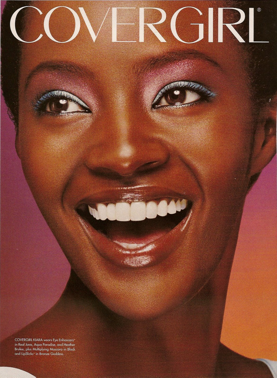
This is a fresh layout. The white text stands out a lot and compliments the model Kiara's smile. The color fades in the background as well as on her face. The overall color scheme is bright and warm. I like it. No homo...
Sunday, December 2, 2007
layout design
I think this design is a good idea, but i would like it better if it were more chaotic with the logo going in every direction.
layout design

I like the colors and the way they used the model as a design. I think it would look better if the background was black.
Friday, November 30, 2007
odd urinal

How to make ugly objects more interesting, I guess would be the approach these designers used. I think this is so funny. I can't imagine anyone being able to keep a straight face in this bathroom. This is a creative use of form in space.

tree house

Who wouldn't want to live in a house that is up in a tree? When I saw this image it made me think back on ideas that I used to have when I was younger. It might be a little strange to live up in a tree but, you would have the best view on the block. The space that the house takes up gives a odd and unusal perspective on life.
Thursday, November 29, 2007
Form and Space Week 10

My friend is getting married at the end of January 2008 and I went with her to a place called Silk Gardens to look for flowers. Silk Gardens is a warehouse full of silk flowers, greenery and plants and their selection is incredible. A lot of the flowers, especially the roses, are designed in such a way to actually feel like real flowers. Without knowing it was a silk flower, or trying to bend it, if blindfolded, you might think it were a real flower. On our trip, we decided to look at Christmas decorations and came across something called an "upside down Christmas tree." I didn't really know what to say when I first saw it, I thought it was a joke. Sometimes people come up with really unique ideas by going against what is normally expected and the result is often great. However, I don't feel this is a successful idea. I think the tree looks silly and I have no desire to ever own one. It's way too top heavy and it bothers my eyes. Although I don't like it, I still thought it was a unique way to play with space.
Form and Space Week 9

At the Renaissance festival they always used to offer hair braiding. There was a whole book full of images of different types of braids; french braids, braided pic tails, braided crowns, etc and for around 20-50 dollars, you could pay to have your boring hair transformed into a work of art. I don't know how these girls can sit there and braid hair all day. I used to coach a basketball team and for tournaments, we would all braid our hair. I remember my fingers started to ache after the 6th or 7th head. I don't know how those at the Renaissance Festival can sit there for hours upon end twisting hair into all sorts of unique designs. I'm beginning to think they might only work like 4 hours shifts, if even that, because I would think it would be difficult to braid hair for longer than that.
Form and Space Week 8

This piece reminds me of the carving we did at the beginning of the quarter with the styrofoam. I remember how careful I needed to be so that I wouldn't put too much pressure on part of the design and cause it to break due to the weight of my hand. I feel like this piece might have been the same way, even through wood is a lot stronger than styrofoam. I love how the piece on the right is carved out, I'd love to look at it from all angles to fully examine the piece. I also love the contrast between the dark maple of the outside of the wood and the white of the inside.
Form and Space Week 7

One of the most unique ways to use space is through spiral staircases. What I love is that through the use of spiral staircases, we have created an appealing, yet still functional piece of art. While these staircases are still functional, I don't like climbing up and down them because I feel very unsteady being able to see the ground and see through the stairs. But the concept of a spiral staircase is a unique way to preserve space and be appealing to the eyes.
Form and Space Week 6

This is the silliest thing I have ever seen. I'm not sure if this was a shoe taken into Photoshop and manipulated, or if this is an actual piece that was photographed. If it is an actual piece, I think it would serve better as a piece of art rather than a functional shoe. The edges would get caught on pants and the sharp edge of the front might be a hazard.
Wednesday, November 28, 2007
Layout Design
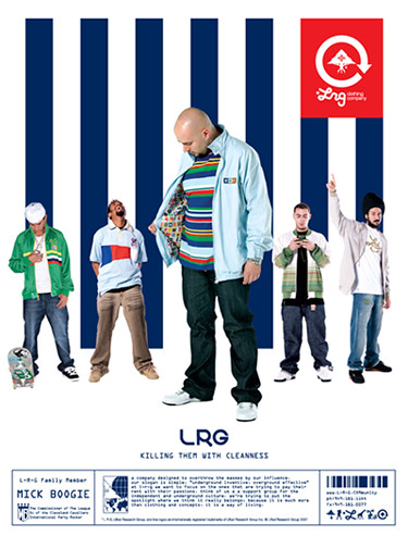
This is an ad for one of my favorite companies. I like the use of navy stripes with the red logo. The model in the front has a striped shirt on that is different colors and opposite stripes than the background, which is goes against traditional design but really catches the eye and works!
Tuesday, November 27, 2007
Form & Space/ 3D class

I think this chair is a great piece of furniture, and furniture only. I do not think anybody can actually sit on it without falling; one would have to be very careful. It is actually very simple and clean cut yet interesting. The chair plays with negative spaces. What makes it interesting though, is the fur on top, without that I do not think that chair would caught anybody’s attention. The fur plays with light since the fur makes many different shapes, shadows, and brightness. By the fact that fur is thin and light, it moves according with the wind, also giving a lot of movement since the chair itself and the fur move. The oval shape guides our eyes around the chair.
Layout Design // New Home
 I just don't get it. It's about a home, but there's no home in the ad. The colors are bold and aggressive, not soothing or inviting. This looks more like a drug prevention ad than an entreaty to sign up a decades-long financial contract. I would've used a softer color palette, serif typeface, and some sort of imagery- a smiling face, relaxing family scene, or a warmly lit house. Something that would convey a sense of comfort, not the opposite.
Monday, November 26, 2007
Layout Design

I like this ad because of the colors used and the overall design. I like how the black backround and the shadows or clothes on the guy aren't seperated and lines are only defined by the change in colors. The ad looks balanced to me because even though the main image is off center there is a logo on the other side.
Sunday, November 25, 2007
Form & Space Wk 9

I don’t know if the artist meant for this to be funny, but it made me laugh! It’s totally out of proportion which is obviously what caught my attention. I’d like to think the artist’s message with this sculpture is that the world is upside down in the way we view people and their proportions, and all are beautiful with a purpose… like art!
Saturday, November 24, 2007
DESERT FUR// LAYOUT DESIGN

This layout is very sophisticated. He looks as if he's wearing a mink coat in the desert. Nice contrast/scale. This is more of a boutique style layout because of the cropped image followed by the list of retailers in well placed text at the bottom. Similar to fragrance ads. This brings high fashion to a Hip Hop ad.
Tuesday, November 20, 2007
 This is a hard ad not to like. It's so simple, yet its message is crystal-clear. Personally, if I ever saw my cat doing this I wouldn't even get mad at him for messing on the carpet! Burying the slogan so far down on the page is an interesting choice; the designer(s) must've known the image was more than powerful enough to carry the meaning if the reader overlooked the copy. At a glance, all I see is a cat and a box of Fresh Step. Well done!
Form & Space/ 3D class

This is a new software for 3D designs.
In this image is interesting to see how 3D designers think and work. As you can see the grids help a lot when developing shapes and shadows. The squares became smaller when placed on a part of the face where there is a fold and they became larger on the larger part of the face like the fore head. The cool think about this software is that even though it is a flat image, you can see all the angles of what it is been designed, you can also play with light, and negative spaces.
PASS THE CO. // LAYOUT DESIGN

I like how the colors in this AD not only compliment each other, they also represent the holidays. I also like the way the liquor logo is incorporated into the design as well as the color fade within the text.
Monday, November 19, 2007

halloween sand sculpture

Even though it’s late for Halloween, I found this picture and thought it was really cool looking. It’s made interlay of sand. I know for a fact that I could never do something this elaborate. The detail is amazing, the face coming out of the gate is really crazy looking.
Sunday, November 18, 2007
Form & Space Week 8

This sculpture is something that we as art students are used to seeing from figure drawing class; however, this is a giant skeleton which is why it caught my attention. The sculptor is Gino De Dominicis and the skeleton is currently being displayed in Milan. Imagine seeing this in the town square if it’s a subject you’re not used to?
Form & Space Week 7

OK! Interesting perspective! A full size man looking at a smaller version of himself in a birdcage; this makes one wonder about the artist and his concept behind the piece and if it is kind of a self portrait or self-expressive piece. Or maybe the goal was to make the viewer picture themselves in this way as if telling them to take a look at themselves..? I think it is well done and interesting to look at. It makes the viewer stop and think.
Saturday, November 17, 2007
Form and Space

Not very comfortable looking chair but it is a great idea. You can actually build a chair made of trash. The fact that he did not painted caught my attention the most because you can see what the chair is made of. What also makes the chair interesting is the fact that the wood is cut in different sizes on the back. On the other hand, the side where somebody would seats is very smooth.