Thursday, November 8, 2007

Form and Space


That is something I think is very cool and interesting as a 3D career. Creating those mini models is definitely not easy but definitely necessary. Most of the constructions out there, houses, building, malls, etc were first sketched and then a little model was designed. It is very important to build those models to have an idea of how the real big think will look, if changes will be necessary, if it will looks good, and the person that creates those models have to pay close attention to all the detail. The model in the picture, I would say is a successful one because is well done with all the detail necessary and you can see the spacing between things.

Wednesday, November 7, 2007

painting--Layout Design


i was search online for some printmakers and well i fell apond this artwork and thought i was cool. for the simple fact that its trippy and its in an office hallway. the concepts in new and funcky, just keep on fallowing the the stipes along the wall to the office.

Tuesday, November 6, 2007

Flyer

I like the way this flyer plays with the comic format, it is clear what audience it is targeted to. I also enjoy the color scheme in the panels, is very simple and atractive. The layout of the boxes makes it very interesting to look at.

African Films Poster


Again, I'm drawn towards simple designs. I like the outline of the face divides the face in two, making the information easy to read. Subtle details like the earing and the hair texture give depth to the picture, making it more interesting to watch.

The Color Turning

I specially loved this flyer because I've been doing band flyers for a while now, and this stroke me in its simplicity. I really like the treatment with the type and the minimalist feel to it. It is very subtle but the image in the background emits the movement and "electricity" of a live show. I think it came across greatly.

Tomorrow Promo Poster

I really like the juxtapostion of images in this image, it makes it very interesting and gives a lot of movement to it. I like the treatment of negative space and the clever symbolism.

Love Poster


I like this layout because the the composition is very interesting, although the woman is centered, she is desaturated and the top half of the poster uses very bright that duel for your attention. You find yourself looking at the poster over and over, because of its intricate detail and interesting layout.

Orion

This is the perfect example of how things work out perfectly by themselves in nature: no measurements, no points or picas, no complications...

For my second object, I had the opportunity to find this nice example of another ornamental figurine. This one has more design and fine concept, besides its size and dimensions. I had this ornament figurine in my house for long time ago; so, I thought it was going to be another good example of good designed three dimensional sculptures/objects. Its design it is quite simple but interesting at the same time. I like the way it was created and set up; mostly its concept. Based on its concept, the design came afterwards, so, I think that the design itself and the concept, they both go along together pretty good, and the whole figure is very fine and its context works pretty well.

New twist on familiar imagery


This drunk driving ad cashes in on the usual glamour-shot style of beer photography by dirtying it up a little and stripping away the glitz. I think it's very effective both in imagery and layout in that it uses familiar imagery in a barren setting to enforce its message. Overall, this ad is effective based more on what it leaves out than puts in.

3d picture


This picture reminded me of another picture that I saw on the blog. It is of a a sculpture that looks like it is 3d. I think that the form of the sculpture is different and the space that it is in is something that leaves thoughts for the imagination. The place looks calm and secrene and like a place that you could just reflect in. The picture looks real and I wish that I could be at this place because I'm sure that right in front of you this sculpture takes on a whole different form.

Cool

I think crop circles are a very creative way of using form and space. Do aliens keep process books?

Monday, November 5, 2007

Calaveras Layout


sc0072cfeb, originally uploaded by GochaNW.

I also like this layout. Its very different. The fact that the text works with the pattern in the background is impressive. It reminds me of a close up of a vinyl record sleeve. From far away you cant tell that the pattern is skulls.

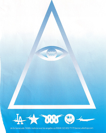
Baracuda Layout


sc00729704, originally uploaded by GochaNW.

This layout is so simple, yet brings the eye right to it, and keeps it in the page. The symbols are also simple yet inviting. I became curious as to what its about and kept reading until the text at the bottom. It might not be good enough to make me visit the website, but I definately think about it.

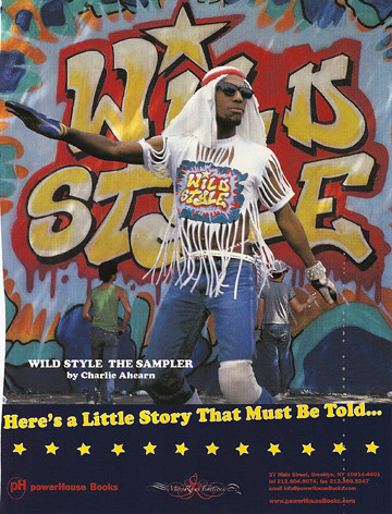
Wild Style Layout


sc0072774e, originally uploaded by GochaNW.

I saw this movie, which is from the eighties, many times. I like how this layout captures the film. I like how the text is going uphill but everything else is straight. Its a great idea to have the title behind the dancer, but in full view, smaller, on his shirt.

Snow


One image is worth a thousand words, and I feel thats the case in this piece.

I know...


Actually I just came across this one by accident, so I really don't know... I just like the composition and the contrast in colors.

St. Pete Pier

Most of us probably don't even think about it any more, but I've always wondered why it would occur to someone to design an inverted pyramid. This version of the pier building was erected in 1973 after the "Million Dollar Pier" was demolished due to hurricane damage in 1967. Oddly enough, this one has withstood the weather. Sometimes I think it looks dated, and other times it looks completely at home... maybe because the pyramid itself is a timeless shape.