Friday, November 30, 2007

odd urinal


How to make ugly objects more interesting, I guess would be the approach these designers used. I think this is so funny. I can't imagine anyone being able to keep a straight face in this bathroom. This is a creative use of form in space.

Form meets function in this unusual bike. Imagine seeing someone riding this, that has to be hillarious. It would definately be a sight to see just crusing down the street. This just shows that you shouldn't throw away your trash, because you might could make it into something useful.

tree house


Who wouldn't want to live in a house that is up in a tree? When I saw this image it made me think back on ideas that I used to have when I was younger. It might be a little strange to live up in a tree but, you would have the best view on the block. The space that the house takes up gives a odd and unusal perspective on life.

Thursday, November 29, 2007

Form and Space Week 10


My friend is getting married at the end of January 2008 and I went with her to a place called Silk Gardens to look for flowers. Silk Gardens is a warehouse full of silk flowers, greenery and plants and their selection is incredible. A lot of the flowers, especially the roses, are designed in such a way to actually feel like real flowers. Without knowing it was a silk flower, or trying to bend it, if blindfolded, you might think it were a real flower. On our trip, we decided to look at Christmas decorations and came across something called an "upside down Christmas tree." I didn't really know what to say when I first saw it, I thought it was a joke. Sometimes people come up with really unique ideas by going against what is normally expected and the result is often great. However, I don't feel this is a successful idea. I think the tree looks silly and I have no desire to ever own one. It's way too top heavy and it bothers my eyes. Although I don't like it, I still thought it was a unique way to play with space.

Form and Space Week 9


At the Renaissance festival they always used to offer hair braiding. There was a whole book full of images of different types of braids; french braids, braided pic tails, braided crowns, etc and for around 20-50 dollars, you could pay to have your boring hair transformed into a work of art. I don't know how these girls can sit there and braid hair all day. I used to coach a basketball team and for tournaments, we would all braid our hair. I remember my fingers started to ache after the 6th or 7th head. I don't know how those at the Renaissance Festival can sit there for hours upon end twisting hair into all sorts of unique designs. I'm beginning to think they might only work like 4 hours shifts, if even that, because I would think it would be difficult to braid hair for longer than that.

Form and Space Week 8


This piece reminds me of the carving we did at the beginning of the quarter with the styrofoam. I remember how careful I needed to be so that I wouldn't put too much pressure on part of the design and cause it to break due to the weight of my hand. I feel like this piece might have been the same way, even through wood is a lot stronger than styrofoam. I love how the piece on the right is carved out, I'd love to look at it from all angles to fully examine the piece. I also love the contrast between the dark maple of the outside of the wood and the white of the inside.

Form and Space Week 7


One of the most unique ways to use space is through spiral staircases. What I love is that through the use of spiral staircases, we have created an appealing, yet still functional piece of art. While these staircases are still functional, I don't like climbing up and down them because I feel very unsteady being able to see the ground and see through the stairs. But the concept of a spiral staircase is a unique way to preserve space and be appealing to the eyes.

Form and Space Week 6


This is the silliest thing I have ever seen. I'm not sure if this was a shoe taken into Photoshop and manipulated, or if this is an actual piece that was photographed. If it is an actual piece, I think it would serve better as a piece of art rather than a functional shoe. The edges would get caught on pants and the sharp edge of the front might be a hazard.

Wednesday, November 28, 2007

Layout Design


micklrgsmallei3, originally uploaded by GochaNW.

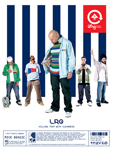
This is an ad for one of my favorite companies. I like the use of navy stripes with the red logo. The model in the front has a striped shirt on that is different colors and opposite stripes than the background, which is goes against traditional design but really catches the eye and works!

Tuesday, November 27, 2007

Form & Space/ 3D class


I think this chair is a great piece of furniture, and furniture only. I do not think anybody can actually sit on it without falling; one would have to be very careful. It is actually very simple and clean cut yet interesting. The chair plays with negative spaces. What makes it interesting though, is the fur on top, without that I do not think that chair would caught anybody’s attention. The fur plays with light since the fur makes many different shapes, shadows, and brightness. By the fact that fur is thin and light, it moves according with the wind, also giving a lot of movement since the chair itself and the fur move. The oval shape guides our eyes around the chair.

Layout Design // New Home

I just don't get it. It's about a home, but there's no home in the ad. The colors are bold and aggressive, not soothing or inviting. This looks more like a drug prevention ad than an entreaty to sign up a decades-long financial contract. I would've used a softer color palette, serif typeface, and some sort of imagery- a smiling face, relaxing family scene, or a warmly lit house. Something that would convey a sense of comfort, not the opposite.

Monday, November 26, 2007

Layout Design


I like this ad because of the colors used and the overall design. I like how the black backround and the shadows or clothes on the guy aren't seperated and lines are only defined by the change in colors. The ad looks balanced to me because even though the main image is off center there is a logo on the other side.

Sunday, November 25, 2007

Form & Space Wk 9


I don’t know if the artist meant for this to be funny, but it made me laugh! It’s totally out of proportion which is obviously what caught my attention. I’d like to think the artist’s message with this sculpture is that the world is upside down in the way we view people and their proportions, and all are beautiful with a purpose… like art!