Saturday, February 24, 2007

Week 7 Analysis


For this weeks packaging analysis I chose Hillshire Farms Deli Selects package. I picked this as a good packaging idea because I tend to buy deli meat pre-packaged a lot and the most frustrating thing is how it goes bad quickly. And then for some reason at the grocery store I decided to pick up this package, just to try something new. Once I got it home and opened it I realized how fantastic of an idea it was. They have their meat packaged in an almost air tight plastic package inside of tupperware. This allowed for the meat to stay fresher longer and also made it so much easier to access the meat. I realize now that even Publix brand does this same thing with their deli meat; however, it is something that was such a simple idea but made a huge difference in how I chose to buy my meat, which in turn probably was the same for other consumers if it was for me as well.

Friday, February 23, 2007

Package Design Week 6 Good Packaging


This is a great design as are most alcohol bottles these days. This one however is not only a great drink but has a terrific design appropriate for the product. It has of course a very elegant look to it with colors that reflect the irish. Dark green is the bottle color and green and a slight tint of orange is on the front. The gold flake color makes the elegant stand out a bit more than usual and the wrapping around the top neck of the bottle also has a sleek design to it. Of course with most alcoholic beverages you tend to think the cheap alocohol is in the plastic containers which usually is true especially with vodka. This is a glass bottle which isn't just clear but a dark green tint . There is a mold into the bottle too to make the product seem authentic and to let you know it passed some sort of detailed process. When drinking you tend to want to drink it slow and savor it as if it's something special.

Vicks


Remnants of my week long half flu, half cold adventure. With my being half out of it for a week I really appreciate the color coordination with the orange for day and purple and blue for night. The directions for how much to take could be bigger, though. It took me a while to find them. I also had a smaller bottle where you had to pull out the label to find all the instructions and those were printed larger. They should do that with all the medication. The type is all right. It’s really big and easy to read, which is what they were going for, I bet. The best part is that they include the little tablespoon-measuring cup. Very helpful.

Package Design Bad Packaging Week 6


The generic brand milk that you buy at the store around here is completely boring. My mom admitted that she buys it simply because it's the cheapest. If they were just to give the design just a bit of spark along with the cheaper price im sure the sales would be improved. About the only thing that is successful about this design in my opinion is the color coding for the nonfat and lowfat milk. Legibility is fine since it's in big bold lettering but the design lacks more than anything. I see Fieldcrest and then a sort of midievil shield so maybe they should let people know or see more the reasoning behind it on their packaging. There is also ALOT of white space on the design and it's basically all typographic in nature which isn't always bad but this one doesn't get away with that. On top of that there seems to be a batttle with the heirarchy of the logo and the title of the product. Both of them are close to the same size so it's hard to read fieldcrest or 1% lowfat milk.

Thursday, February 22, 2007

Conceptual Imagery - THEN and NOW


This is two images for THEN and NOW. Then to me right away reminds me of the not too distant past of the last 100 years and how much communication has evolved. I simply illustrated the older ways to communicate and how they have wired devices. Now of course everything for the most part is wireless and much more instant and easily attainable. You also aren't stationary all the time when communicating either. Morris code was primitive and you'd have to send and wait awhile for a response. You wouldn't be able to move anywhere or relocate. Now you can be walking almost anywhere while instantly communicating with friends and family. We accessed information with books and now we can access any book or source of information almost instantly. It's for the most part evolved so much that it really doesn't get much easier than it is now. Everything takes less time yet everyone walks around saying "i'm so busy" or "i never have enough time".

Wednesday, February 21, 2007

Conceptual Imagery JOY AND DEPRESSION


Joy and Depression to me are illustrated such as depression makes me think of the "emo" kid or depressed teenager who creates problems in his mind and likes to express it by cutting himself. Depression is to me typically someone who never smiles and wants to end therir life. Being someone who suffered from it in the past after a close friends death you can just sit in ur room and look sad for days on end. The imagery though that i used it based off of the stereotypes of today for people who are depressed. "Emo" supposively means emotional or from what i've observed are kids living in good neighborhoods with a good life but sit around and act like their life is horrible and talk about it all the time. I think it's actually pretty hilarious so i made sure the picture illustrated how silly the behavior is. I have known people who actually do cut themself and they had extremely severe childhoods and living conditions growing up so when i see or hear about "emo" i think personally they are complete idiots. Anyways here is my illustrations including joy. Joy basically reminds me of the blonde bimbo in her convertible mercedes benz speeding down the road chatting on her cell phone just being completely the opposite of the "emo".

blog5


file:///F:/blog5
This was a nice reflection of what the company was about. I guest I just was drawn to the photography again.

blog4


file:///F:/blog4
I just chose this one for the interesting layout. Using the pictures to tell a story. This sells the idea.

blog3


file:///F:/blog3
This was a fun picture. Not understanding completely what they are trying to communicate with the ad but maybe fun to wear the shoes.

blog2


file:///F:/blog2
I enjoyed the photography of this one. That was about it. The colors was nice too. The layout a little questionable.

blog1


file:///F:/blog1
This piece has alot of white space. I do like the photographs involved. The names and picture are easy to understand.

light_designlayout


This actually caught my eye. I love the usage of typography with this one. It makes me want to read this boring article.

Monday, February 19, 2007


I decided to go with a bit of a typical approach to joy and depression. I did these illustrations as a set to show the eye in one frame and the smile in another. The smile is showing teeth and is clearly a happy smile, one of joy. The tear, on the other hand, expresses depression. I feel a simplistic approach just lets the image speak for themeselves and in this case, I tried to illustrate joy and depression in the rawest way possible.

Sunday, February 18, 2007

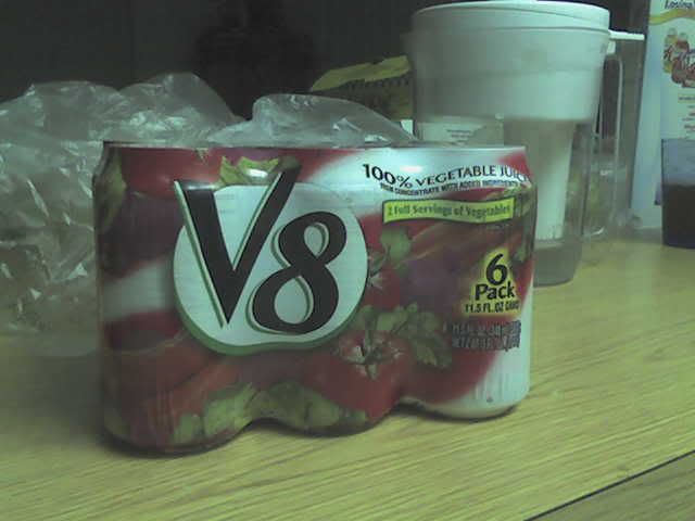
Week 7 Package Design


So I have recently discovered that V8 now comes in cans!! I bought this today grocery shopping and I totally had to have it. The shrink wrap is what suckered me into it. I really like that they used the shrink wrap instead of a box or those plastic rings, it looks very slender.I would think they were marketing to women from how shapely the packaging is. It has a very clean design and holds 6 cans. The white stands out on the shelves around all the other red tomato juice labels in the area. It also is the only canned tomato juice available from what I saw. The typefaces are used very well also, not too tacky. I really don't even mind the semi-outline on the V8 logo. Maybe the packaging will entice others to drink more V8!