Saturday, November 17, 2007

Form and Space


Not very comfortable looking chair but it is a great idea. You can actually build a chair made of trash. The fact that he did not painted caught my attention the most because you can see what the chair is made of. What also makes the chair interesting is the fact that the wood is cut in different sizes on the back. On the other hand, the side where somebody would seats is very smooth.

Tuesday, November 13, 2007

Dane Cook/ Rough Edges


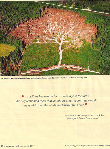
I chose to post this ad because there are some good points and some bad points worth discussing. On the good side, the use of yellow for the important text was a wise choice. It definitely pops off the page compared to everything else. Second, using text colors to coincide with the colors in the photo is also a nice execution. And finally, using rough edges on the ad for the "Rough Around the Edges Tour" is an obvious, but visually-appealing move. On the bad side, the photo seems pushed off a little too far to the right; I would like to see a little bit of megative space between his arm and the right edge. Second, and this may just be my OCD acting up, but having the "On Sale Now!" bubble tilted even further than the surrounding copy bothers me. It's not enough to seem deliberate but still enough to notice. And his logo in the upper right is straight, whereas all the other non-photo elements are tilted until the bottom of the ad. There seems to just be a few angles created in this layout that draw attention, but aggravate my eye at the same time.

LAYOUT DESIGN POST// DARK KOBE


I like this dark, almost Comic Book style layout. The light illuminating down the center of the image is nice. The tiling and color of the background and floor make the entire image more dramatic.

Monday, November 12, 2007

This Old Church


I took this picture in Montana when my family was on our trip back from Yellow Stone National Park. This old church was in the middle of nowhere, it had nothing around it for miles. I love the old church styles their so peace full looking to me. I like the look of aging buildings, this one reminds me of something I would see out of a movie.

falling water

This is Frank Lloyd Wrights "Falling Water" in PA. The house is now a historical site, its built right over a water fall, it's also known for being able to bring the nature into the house. What I mean is that some windows are designed with no corner so you can feel open with your surroundings. Wright also made it were the book shelves and desks and so on are built right out of the stone from the house. Wright was a brilliant architecture and will always be a master of design in my book. If your ever up in PA I strongly suggest you make a trip to Falling Waters.

Form and Space


This is an example of Frank Lloyd Wright’s architecture found at Florida Southern College in Lakeland. I took this photo for the “Architrans” assignment in DVC. The wall looks textured but relatively flat from far away, but when you get up close you can see how much detail went into creating the texture. There are deep blocks cut out and steps cut into the sides. I say “cut out” but I don’t know whether maybe this is actually concrete? I know a lot of architects felt liberated by concrete earlier in the 20th century. It’s very useful for creating such detail. What I love about this wall is that it can be viewed and appreciated from all angles. In that way it actually defies the definition of a wall. I looked at it from underneath, straight on, and both sides, and always saw a new, interesting view.

Form & Space Wk 6


This is just awesome! I love horses and I think it’s an interesting sculpture. The artist made it out of driftwood! I’m not sure how it’s put together, but I really like that it is made of materials that would otherwise be wasted. It also gives the horse a cool look, and surprisingly a pretty realistic one. I wonder if the artist was picky about the pieces or wood he used or if he just used what he had and fit it where it would go? Either way, I enjoy looking at this one

layout design


tree, originally uploaded by GochaNW.

I like this layout because it keeps the attention on the photo. Its cool how the paper is not white, its a similiar color to the "trunk" of the tree image.