 This one is just hilarious plain strange! I’m not sure if there is a particular purpose for it, but it is definitely an attention getter! I think it’s supposed to be an alligator? So, instead of the normal human or even bear on a unicycle, we get an out-of-proportion alligator, juggling balls while wearing red and white striped stockings and a smile. Not really my kind of style, but it caught my fancy, so the artist is effective in that department.
Saturday, October 27, 2007
Week 5 Form & Space, Getting ahead:)
This one is just hilarious plain strange! I’m not sure if there is a particular purpose for it, but it is definitely an attention getter! I think it’s supposed to be an alligator? So, instead of the normal human or even bear on a unicycle, we get an out-of-proportion alligator, juggling balls while wearing red and white striped stockings and a smile. Not really my kind of style, but it caught my fancy, so the artist is effective in that department.Week 4 Form & Space

I thought this particular sand sculpture was interesting because it seems to have a subtle message behind it. I like that all of the hands are together, kind of like when a group of people huddle up or to agree on something. I think of something for the greater good when I look at the sand sculpture, it’s different but still simple. Again, I wouldn’t have the patience to work on something that is as vulnerable to most things as what sand is, so I probably wouldn’t attempt any artwork with the medium!
Week 3 From & Space.. Getting Caught Up!

This 3d object looks like something that would be used for a movie prop. I thought it was interesting because of the resemblance of an amphibian or insect/ machine which everyone can relate to from the project in Rapid Visualization class! Perhaps a large komodo dragon or other large lizard… the back end of it also looks kind of like the tail on a dragonfly. I would probably like it more if it was more aerodynamic. I do however admire the funky legs it has; they remind me of what could be some really limber walking canes with the four peg feet! I was trying to think of something good to call it, but couldn't come up with anything, so I'll just call it the cool ship thing! :)
Friday, October 26, 2007
week 3 FORM&SPACE

This is another example of the neatest and well elaborated design ornaments ever made. This is a sculpture that represents the dolphin life. In spite of being just an ornament, the point is that it was made to be interesting enough so its whole design and aesthetics could be appreciated by everyone. Its structure makes us to believe that it was probably a little difficult and complicated to make, but its finished design is definitely well crafted. It has diversity in form and space since it can be seen at different angles and perspectives but it keeps the same proportion. Nevertheless, the dolphins seem to be different at different views, but that can be due to its design itself and the way it was thought to be executed. Finally, the entire sculpture has unity in the sense of the whole conjunct of the dolphins and what is supposed to be the water wave that accompanies them; giving the idea of a very neatly elaborated ornamental piece of art.
Tuesday, October 23, 2007
Form and Space

Totally cool… ☺
Daily objects redesigned to make not only usable but also beautiful, a piece of decorative object. I really like geometric shapes but in this case the organic shapes are very effective. The round format guides your eyes trough the whole piece.
The different shapes on those objects also play with light making very bright on one side and very dark on the other sides. The use of negative space is great also.
The shapes, the texture, the whole design itself are very modern and contemporary looking. It is also very clean and simple.
For this format of design with different shapes all around white is the best color for it, more than one color would be too busy and all black I don’t think one would be able to see the shapes and shadows as much as white.
I don’t think those shapes would be easy to clean but it is worth it since they are very attractive.
Monday, October 22, 2007
JEAN L LAYOUT DESIGN WEEK 3 POST

I like the color scheme/color blend in this ad layout. Everything flows. I'ts clean, vibrant, and fresh. Goes well with the mint theme. I like how Venus Williams' dress becomes a mint leaf, that's creative.
Sunday, October 21, 2007
Layout Design Week 3
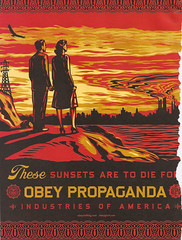
I am a big fan all around on "Obey". I love the message as well as the layout of this piece. It is eye catching. The boarder around the layout is very different than most advertisements that you see, most have no boarders at all. The way that he writes "these" is especially interesting. One can definitely note, in my opinion, the cynicism towards "America" and the world around us.
Subscribe to:
Posts (Atom)