Saturday, December 8, 2007

Form & Space for Week 11


Funny! I thought it was real at first, and had to take a second look to be sure. This actually makes me think of Marcel Duchamp’s ready-mades because it looks like a realistic object (person) just attached to the exterior wall of a building. It also makes me wonder what the artist’s message was for this piece… peeping tom.?

Friday, December 7, 2007

SABOTAGE SCULPTURE. Executed by H.R. GIGER


"The State of Sabotage is manifested in a unique sculpture that serves as a monument to artistic vision, territorial free spaces and independencies.
Sabotage mastermind Robert Jelinek invited the Swiss visionary and artist H.R. Giger to design the sculpture. H.R. Giger's sculpture model consists of a pair of shoes cast in an iron/copper form and welded to a metal base. The sculpture will be installed at the highest point of Harakka Island. Visitors to the island can step into the shoes and, by wearing them, comprehend the island as space and merge with the ground. The unveiling of the sculpture will be accompanied by a musical live act by Philipp Quehenberger. The sculpture will remain forever on Harakka Island."
http://www.sabotage.at/sos/sculpture.php

I just thought this sculpture was interesting. I love how a hard substance like metal can look like just about any other material.

The Pantheon


I had to study this for Art History 1, and thought it would be a good Form & Space post:
The Pantheon is the best-preserved example of monumental Roman architecture. It consists of a large top atop a rotunda. The thickness of the dome varies from 21 ft at the base of the dome to 4 ft around the oculus. The 5,000 tn weight of the concrete dome is concentrated on a ring of voussoirs 30 ft. in diameter which form the oculus while the downward thrust of the dome is carried by eight barrel vaults in the 21 ft. thick drum wall into eight piers. It was built of a very strong concrete with pozzolona cement. A gradation process was used so that the structure is heavier at the bottom and much lighter at the top. The dome's oculus or opening lightens the load and acts as a compression ring. The dome is a masterpiece of engineering: it is the largest dome ever covered by masonry and it was cast in a single operation on an imposing wooden centering. The Pantheon still holds the record for the largest unreinforced concrete dome in the history of architecture.

Thursday, December 6, 2007

Form & Space/ 3D class


This is one of the wonders of the world. It is so hard to explain what you feel when you are up there looking at the statue. It is so amazingly big, you can barely see all the way to the top. The location where they decided to build this monument is also the best. It is one of the highest mountains in Rio de Janeiro and you can see the whole city from the top. The artist wanted to build that statue to represent Jesus looking after and blessing Rio de Janeiro.

Form & Space/ 3D class


What caught my attention about this picture is that even though it has no color and it is made of concrete you can actually feel the interaction between the girls carved.
The stone as carved with a lot of details, it impressive how the artist can do that in such hard media.
The hair is well represented and the hands as well. One can tell that they are comforting each other and they appreciate the company of each other.

Wednesday, December 5, 2007

Make a wish

Fountains not only use shape as design, but also the water. These dandelion looking fountains are really cool. A well-crafted design.

Got milk?

This is a lamp. I like this one because a common object is approached from outside the box.

Tuesday, December 4, 2007

I like this advertisement because it is simple and I knew exactly what it was about as soon as I looked at it. I like the image and the way they made the feather and sandal look so similar. They also form the Hurley logo which can bee seen in the top right corner of the advertisement.


US Focus vs. UK Focus

It may be slightly off-topic to get into automotive design, but humor me here. First up, we have the all-new 2008 US Ford Focus:

The lines on this car are just too busy. There's hood ridges, lines through the headlights, 2 contrasting arcs making up the top and bottom edges of the headlights, etc. There are curved lines, straight lines... it's just a mess of different design cues and lacks cohesion.

Then you have the UK Ford Focus:

This is a great design. The lines are subdued and refined, with each complementing the others. The symmetry created by the foglight alcoves and the headlights is nice, as well as the lower air scoop and the main grille.

Overall, it's like the US Focus is a slasher flick and the UK Focus is a taut psychological thriller. The US version has more shock value, but the UK version is much more tasteful.

*In the interest of fairness, both of these images were taken from Ford's sites. Presumably, this means these are the best possible angles/images of these vehicles.

Form & Space Wk 10


This sculpture seems too colorful for the environment that it’s standing in! Its odd organic shape looks like a bunch of snake heads coming out of one body. I’d like to know what the artist’s concept was!

Pictures


At a first glance I sense a feeling of happiness. It is a very positive art piece. To me it display a harmonious balance between all of the elements within it and allows for a creative personality. It seems as if it is coming at you.


This creation puts a lot of emphasis on form. It is unique in its own way by being chaotic and yet symmetrical at the same time. The use of thickness and texture on each element portrays a sense of strength in the object and/or its meaning.

Monday, December 3, 2007

COVERBRIGHT// LAYOUT DESIGN


This is a fresh layout. The white text stands out a lot and compliments the model Kiara's smile. The color fades in the background as well as on her face. The overall color scheme is bright and warm. I like it. No homo...

Sunday, December 2, 2007

layout design


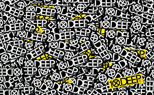
10.Deep_953_img, originally uploaded by GochaNW.

I think this design is a good idea, but i would like it better if it were more chaotic with the logo going in every direction.

layout design


28_home_article_image_701386424, originally uploaded by GochaNW.

I like the colors and the way they used the model as a design. I think it would look better if the background was black.