Saturday, February 17, 2007

Week 6 Analysis


I chose Dolce and Gabbana's Gold Razor packaging because of its extremely sophisticated packaging. Not that I would expect anything less from the high-end designers; however, it is still so successful for the demographic they are targeting. Because the people who are buying these phones are buying it for the name and the status that comes with it. The packaging lends itself to that with its James Bond type of casing, brilliant black and gold coloring that incases a sleek shimmering gold phone. The consumer buys the phone for the name and when they recieve this packaging it is only going to reconfirm that feeling of high-end retail and status, to them money well spent.

Week 5 Analysis


Within the past year the cosmetics company ALMAY redesigned their packaging and store displays. They made use of the first letter of ALMAY, A, in lower case, serif form. They did something unique by using the lower case serif when the actual logo is a sans serif logo type. However, the typeface they picked is femine, but not overly ornate and flows nicely through its thicks and thins. I think the redesign was successful because of their use of this one letter. It became a strong recognizable graphic for ALMAY. They took something relatively simple to the consumer and made into a strong, eye-pleasing graphic...congrats.

Foot Lotion Anyone!!

I have so many bottles of lotion that are about the same shape but with varies size. This particular lotion bottle is UNIQUE. Its as you can tell is foot lotion. What is the only ways to portray foot lotion besides putting a different font on a lotion bottle that says foot lotion? The designer that came up with that idea by imitating a foot as the lotion bottle is clever. The colors of the label is so calming to the point where when you put the lotion on your feet that it will be release to a new feel.

Friday, February 16, 2007

Contrast_designlayout

This layout stuck out to me, I was searching, and i said to myself, this is something that i could see as a good clean layout. I labeled it contrast. It shows a balance.

Vibe_designlayout

i liked this layout. I enjoyed looking at the cover, and besides I am into this type of stuff, with layout, clean simple and to the point. This image works well because not only is the magazine called Vibe, but the shape of the figure is almost in the V shape as well.

Thursday, February 15, 2007

ladybug


Tomando un poco de libertad

Catch a cab

Bullet point


five week assignment


Dessert Discs

I read an article which title was desert discs. I thought thar dessert discs was more interesting.

Nemo Wheelchair

I draw my Nemo Wheelchair for the first week assignment.

Buffalo Shot

Hero Fantasies


Been a big fan of Wolverine I was attracted to this package. It’s a comic hero recognized by multiple audiences almost anywhere you go. The thing that attracted me the most was the big “X” in the center of the different packages stating X-Men. Die cuts in packages always makes them of greater value and more dynamic compared to the ones that are completely enclosed in a cardboard box. The colors are also really bright making it stand out from the crowd and make it desirable to little kids. The pictures also convey he is a superhero and I can see kids relating to this toy trying to fulfill their hero fantasies.

TRY ME!!! TRY ME!!!


The first packages I go to in the toy section are the ones that you can try. That hole and the bold letters “TRY ME!” are pretty powerful to my imagination and I am sure the same goes to other people. It’s a need to know what goes on inside that package. Package designers know that, make it possible for the consumers to have the experience before buying the toy. When kids try it, it makes the emotion of wanting the toy even stronger. It was also placed in the hallway of the store making it more accessible to the public.

Hi Nemo!!


This package brought my attention since it has multiple bright colors that contrast with the black outlined illustration inside the package. It is a clever idea to make you want to paint the black illustration just like the one in the package. The die cut of the fish and the surroundings also makes the package interesting to little kids adding to the fact that the cartoon is popular to that audience. I also noticed that mostly is about Nemo and not the brand itself. You can see the brand only in the top compared to other Crayola products that have their yellow and green all over the package.

Great Value Oatmeal


The first thing I noticed is that the different packages with different flavors has no distinction at all except for a little hint in top of the actual picture of the oatmeal. The way the photograph was taken, at a glance it all seems repetitive between the packages. Next to it is Quaker, which plays with a lot of variety of brilliant colors and shapes making it more pleasing and attractive to the consumer. You can also see that even if they are all oatmeals, Quaker has different variations for each of their variety packs. Great Value Oatmeal is also lost been in the middle of all Quaker products. It clearly overwhelms the poor design of the store brand.

Emily's Nuts


This is a very successful series of nuts. Other than having a very clean design, it conveys a natural, healthy look. The product is shown in the front in a very “seductive” way creating flowers with a combination of organic strokes and the product itself. The typography and ivory color really sets the mood and style for the package. The bag was made out of a strong paper almost translucent that it makes the product feel of greater value.

Wednesday, February 14, 2007


Here is an idea of what I thought to be a good design.
Photobucket - Video and Image Hosting


This was one of my favourite finds this week. it's nostalgic, and communicates clearly.
i also really like the layout with the band of photos running through the middle. it's separates the page nicely.

Package Design Bad Packaging Week 5

This has got to be one of the worst design choices for WATER. Yes ladies this is water not tampons believe it or not. The typeface and color scheme clearly yells out that it's that time of the month to buy it. But this product you can buy anytime your thirsty. Ok so maybe your not exactly thirsty anymore but that would just further support why this packaging design is inappropriate for the product. This was in the water section on the shelf next to the generic zephyrhills brand which was sold out. This package would solely rely on female drinkers because no guy will buy anything in those colors unless he wanted his masculine friends to taunt and tease him. What's even better is it comes in berry flavor!

Week 5- Layout Design


This is the flyer for a team production game design project. The layout is ok nothing special but ok

Week 4- Layout Design


this is the flyer for the camotion event. A lot of time went into laying out theis design.

Week 3-Layout Design


This is a sign that I saw when I was in Miami, The actual layout of it is ok BUt I dont like the wasy is done. THe with on the light skyline can make it difficult to read for some.

Week 2-Layout Design


This is a peice of hand drawn layout. I personaly think It was done quite Sucesfully

Tuesday, February 13, 2007

Layout design


I found this near ybor.
it caught my attention

Layout Design wk 6

I don't care much for this layout, the photo seems to make the left side way too heavy.

Design Layout wk 5


I didn't care much for this layout, it reminds me of back in the day when the public schools would give you a prize sheet for selling the most goods.

Rapid Viz wk 6


This is my "Astronaut Stalker"

Rapid Viz. wk 5


this is my "Storms Sweeping Across the Nation"

Travel

You see it in movies and on television...someone on the plane with the markings all over their suitcase showing how "worldly" they are. Even in the movie "Airplane" when the very disturbed man brings a bomb on the airplane in his suitcase, it is marked this way. I believe that this is the most typical and recognized way to display that someone has traveled the globe.

Fear

When you think about fear, it's really just keeping yourself away from something...usually something that it isn't necessary to protect yourself from. You lock yourself away and try to keep whatever it is that frightens you...whether it be commitment or spiders...as far away as possible. This is why I drew this door, chained, taped and blocked off from the world.

Death

I think that, universally, death is always symbolized as a tomb stone. This is the most recognizable way to illustrate death. I am a believer that the person's life is what should be celebrated, not their passing on...but in our society that is what is usually remembered most...the headstone.

Monday, February 12, 2007

Travel and Commute


When I think of travel, I think of foreign countries and tourist attractions. Thats what I wanted to convey here in this illustration. A couple, looking at a map, perhaps in a foreign country. To me that says travel.

When I think of commute, I think of the commute I do everyday, which invloves traffic. Here, I found a photo of people in traffic and if you look closely, you see his angry face in the side view mirror. That's what I look like in traffic as well.

layout design week #5


This is to show the two things that you do not want to lose when you travel-your passport and your luggage. No matter how amazing your trip is, losing either of these items can be extremely inconvienent and maybe even ruin your trip.

Package Design


Ok, so we know there are pickles on this shelf. That much is certain. What we don’t know, is which brand is which?! Mt. Olive is a pretty popular brand, with a very bland design. I see what they were trying to do in designing these labels. They wanted to make the label look like a pickle, or at least, the color of a pickle. Unfortunately, in doing so, their label blends in with the “real” pickles inside the jar. Too much green and yellow is hard to look at. Vlasic took a stand and changed their label to blue. This was a smart move on their part. Even though Vlasic is all the way to the right, their jars still catch my eye. I would have to say that even the Winn Dixie brand of pickles stands out more than the Mt. Olive brand.

Package Design


I think this enviga can has a very successful design. I opened up my refrigerator, which is piled high with food and drinks, and the first thing that caught my eye was this can. It uses bright colors and a popping design. I think it would stand out among the other cans in its section. I think the only problem with it, is that until now, I hadn’t even read the label or what it contained or what the actual drink was. I was too involved in the design. I don’t think the consumer would have a problem with this though, because if they like the design when they are in the store, they will quickly move on to read about what the drink is all about.

I put money in the bank!!


I like football and the Bus are Ok, but hey I got this for FREE when the Buccaneers won the Suprbowl XXXVII. So anyways, I like how its a bank but the thing about this bank is that it's shape into a miniature size football champion trophy. Even though it has a plain sticker label in the font. With the design element so strong from the bank shape itself it really don't need anything else on here to compete with the bank.


I like football and the Bucs is OK but hey it was FREE and I got this when they won the Superbowl XXXVII. So anyway, I like it how it is a bank but the cool thing about this bank is that it's in a shape of the miniature size champion football trophy. Even though it has a plain sticker on the front that says Buccaneers on it. But the design element of the bank is big enough to where nothing else should be put on here to make it busy and compete with the design bank of itself.

Seacret


This is a nail and body care kit called Seacret from the Dead Sea. My mother got this as a gift for Christmas about couple of years ago. When I saw it on the dresser all alone it still caught my eye. Although it was by itself but, keep in mind my mother dresser is burguny, it stand out to me where the colors on the package is a very female like almost in the sense of Victoria Secretish. In the front and around the back it has some rocks of some sort that immate rough skin and when you use the product you will have the smooth skin like the female on the back of the box. The only thing that bothers me is that this is nail kit as well and it really doesn't show much of the lady finger nail.

Week 6 Package Design


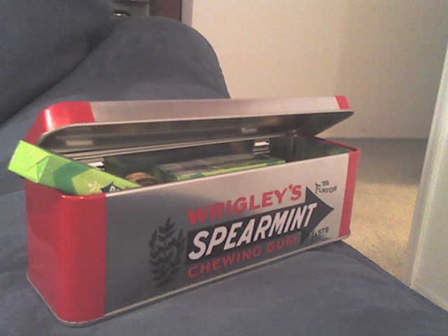
I got this Wrigley's gum tin package as a stocking stuffer for Christmas two years ago and it still has gum in it, I even found some Christmas chocolate coins in there too! I saved this tin because I liked the packaging. It was originally stocked with four different flavors of gum and had 12 packs in it. I thought this was a great idea because for people that like to chew gum a little storage container is pretty cool. The colors are simple, just red, white, and black painted on the metallic silver tin. The tin has a hinge to connect the top so it is easliy opened and you don't lose the lid. The layout of the text and graphic elements gives it a very nostalgic feel. I feel this design works because it is very simple and clean. Best of all, when your done chewing all the gum, it is the perfect size to store pens and pencils!

Sunday, February 11, 2007

Travel makes me think of the preperations that go into it almost more than the trip itself. Doing all the work like planning, buying tickets, and packing give a real sense of momentum sometimes and take us out of our daily routines. That's why I chose an image of a suitcase to represent the act.
With the veins and the empty eyes, I'm trying to show rage as something that makes your blood run hot and shuts down our capacity for rational thought for a while. Rage can make people feel rightous in acts of violence and can let them give themselves permission to do terrible things, so the expression I chose for the mouth is a smirk rather than a grimace or a snarl.