Saturday, February 3, 2007

Rage


Rage: angry fury; violent anger (dictionary.com). This is an illustration of a person’s head bursing off their neck. I thought of drawing angry eyebrows or a person yelling or maybe the typical drawing of a person with smoke coming out of their ears. Have you ever heard anyone say something like, “I’m so mad my head is going to blow”? Well, I was attempting to portray something like this. I know that when I get mad I feel sometimes that my head is just going to blow up.

Weekly product Analysis


Vlasic Kosher Dill Pickles
I chose to analyze this product package cause it was one that caught my eye. Lets start the obvious; the character on the label. I think that the cartoon character is appealing to any age generation. It could especially appeal to little kids. I think this was done to appeal to a boarder audience, especially to kids ho don't like eating there vegetables. The large typeface also stands out more so than its competition in its environment. The color is an appropriate choice. The blue is very bold, and stands out from the competition, [winn dixie] blends in with the shelves. The “vlasic” company has been around since 1942, so it has a great reputation, and has a better chance of being purchased than the competitors
.

Weekly product Analysis


Goya Vinegar
One of the products i chose to analyze is a bottle of “goya” vinegar. I think that the products package is very effective. I believe that it defiantly “holds its own” next to its competition. The dominant Goya typeface is a well known company, and is a trusted one, so that alone I think says gives this certain type of vinegar the advantage. In the products environment, it is the only bottle with a blue background on the label, with a gold trim. I think blue behind the plate of fruit makes the food ‘pop’ more than it would in front of a white background. The label is simple yet classy with the italics next to the normal font. I believe that the labels colors work equally effective with either white vinigar cider vinegar. With the white vinagar, the clarity of the liquid makes all the white type pop even more. With the cider vinegar the yellow tint of the liquid also went well against the blue, and the gold label.

Weekly product Analysis

Goya Vinegar
One of the products i chose to analyze is a bottle of “goya” vinegar. I think that the products package is very effective. I believe that it defiantly “holds its own” next to its competition. The dominant Goya typeface is a well known company, and is a trusted one, so that alone I think says gives this certain type of vinegar the advantage. In the products environment, it is the only bottle with a blue background on the label, with a gold trim. I think blue behind the plate of fruit makes the food ‘pop’ more than it would in front of a white background. The label is simple yet classy with the italics next to the normal font. I believe that the labels colors work equally effective with either white vinigar cider vinegar. With the white vinagar, the clarity of the liquid makes all the white type pop even more. With the cider vinegar the yellow tint of the liquid also went well against the blue, and the gold label.

Hungry Jack Maple Syrup

Michael Phillips
Hungry Jack Syrup
One reason I chose this product is because of how it caught my eye. Hungry Jack syrups are well designed syrups. The oddly shaped syrup bottled are original, and gives them personality, and are different from the rest. I like the close up photos of the pancakes in each kind of syrup, its constant, and makes them very appetizing with the syrup running down them. I also like the colors used in the deign. In each kind of syrup by hungry Jack, they use different colors, but they still have the same feel, and consistency, and that works well for it. I also think that the typeface that was chosen was a great choice. It works for any target audience, not limited to a certain group. Its not too “corporate” and not too playful or too kid friendly. It works well. I also like the yellow ribbon, it gives it just a hint of class.

Friday, February 2, 2007

BAd


This new moms stress survival kit has its ups and downs. I love the illustration, its got a good style going for itself but to be honest I really just cant stop thinking a double cheese burger is going to pop out of it. It screams mcdonalds, the typography the size everything. With a few tweaks I think I would absolutely love this package but where it stands right now I think it needs work and I would not want it on the shelf. It’s a shame cause they have something great.

package design


To be honest at first I did not know how I felt about this package. But over time it kind of grew on me. I love how the cow looks so feminine like a girl worried about her weight. The cow like lining around the outside is a nice touch. It says low fat right off the bat. The colors are very vibrant and tasteful. I give this package a good to go on the shelves.

good package


For this weeks packaging I decided to talk about Crate & Barrel’s gift box. It is all about typography, very simple a lot of white space, and the type goes all the way around to the other side. I thought the packing string were a nice touch to keep the object safe on its journey. Simple, practical, and not over the top. Just right

layout design week #4


the only good thing i have to say about this is that i like the colors.

Thursday, February 1, 2007

Wednesday, January 31, 2007

Reversible Hobo


Walked into Target, saw an endcap of bags called "Reversible Hobos" - what a fun phrase!

Ravishing Taxidermist


Taken from the subject line of spam email

Fear


When doing fear i thought of the whole kissing a frog and having it turn into a prince. We always think frogs are gross but they may say the same thing about us, who knows. Thats why in my illustration i had him all worried and freaked out.

Death


When thinking of death the first thing that came to my mind was a dead body. That was a little to harsh to draw, so the second thing that poped in my head was the family guy episode where death comes for peter. Death ends up being kind of humerous, and lives with the griffin family. So for my drawing i have death. It is a very recognizable object.

thirsty

Tuesday, January 30, 2007

Rapid Viz wk 4


my sketch for wk 4

Rapid Viz wk 3


my sketch for wk 3

Rapid Viz. wk 2


this is my sketch for wk 2

Layout Design wk4


I really like the layout on the sticker of this spray

Conceptual Imagery BIRTH/DEATH


I'm going to have to go with symbolic pictures for this week's images. The first is birth which to me always is a funny image as a woman giving birth and shes screaming in agony as the baby is born and the father gets to first hold the baby with her and suddenly she goes fromt he msot pissed off woman in earth to suddenly tranquil. The second image is of a skull and crossbones which pretty much sums up what everyone turns into (unless cryogenically frozen) after they die. I also have an outline of a dead body from a crime scene which is more of an image that comes to mind from watching too many cartoons or old hollywood flicks.

wk3: birth


Originally, I sketched out an egg that was cracking open as the lil guy inside was just starting to try to bust out. However, when I checked the site, I saw that someone else has already used that idea so I decided to go with something else. Of the rest of my "birth" ideas, the tadpole was my most successful. Since it's the early most stage of a froggy's life (aside from the egg of course), I thought that it was very suiting for this illustration. At first, I colored it with grey scale Prisma markers, but I got quite a few comments about it looking like sperm. As much as that may fit for this assignment, it was not my intention. I decided to change the lil guy's color to green in hopes that people will start associating it more with a frog and less with the male mammal reproductive cell.

Monday, January 29, 2007

Birth and Death


These represent Birth and Death. I had the idea that when we are born we are tagged with the hospital bracelet. It says our name and birthdate and the hospitals imformation. When we die, we are also tagged. Although the image of the toe tag may be a bit morbid, I think it gets the idea across of birth and death in striking manner. After doing the illustration I began to wonder if they put our birth date on our toe tags. Just a thought.

conceptual imagery week #3


I wanted to post both of these pictures to represent the different ways to view death. Death can be ubrupt and unexpected and can lead to confusion and denial but death can also be a release from pain and can be peaceful. I made the background colors opposite from each other to show how the same event can cause two very different reactions-as different as night and day.

Sunday, January 28, 2007

Week 4 Package Design Anaylsis


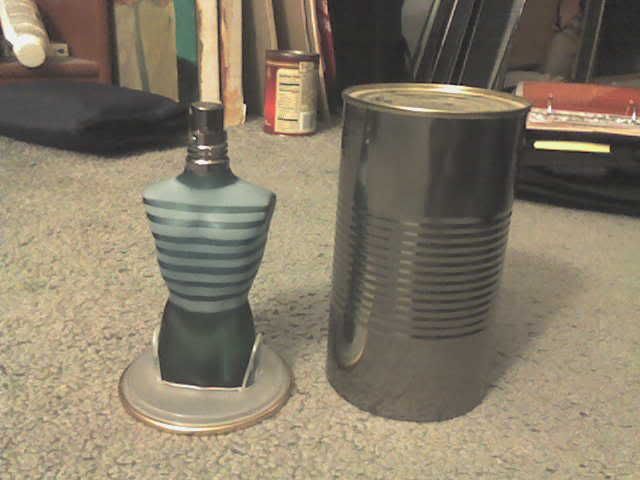
This is my boyfriends favorite cologne, Jean Paul Gaultier's
"Le Male", I thought the package design for this product was very one
of a kind. The cologne itself is packaged as a torso figure of a man,
adding the effect of stripes makes it seem as if the bottle is wearing
a shirt. The package for the bottle is just a plain tin can, retro
fitted with a removable base/lid of the can with a plastic inset to
hold the bottle in place. I thought this was an amazing package design
for what is really was. But when thinking of seeing this on a shelf at
a store, the can, or outside packaging, does notdisplay the name of the cologne prominently enough for someone who doesn't know Jean Paul Gaultire's cologne. The name itself is embossed into the can and there is no other color placed onto it to increase the awareness of the name of the product. If I was a consumer searching for the perfect cologne for a christmas gift I would not think to try this one if it was closed up in its package, I would want to see it merchandised apart like I have it shown in the picture.

Package Design week 3 GOOD PACKAGING


Here is a simple me too type of product which is something we all use or HAVE to use for that matter. The nice touch though was how it uses the colors to seem natural and almost seems like it would be softer compared to the brand right next to it by publix. The darker paper color helps it and also the name and typeface is very subtle but appropiate for the product being sold in my opinion. Green/Wise so your making a wise descision by buying recycled paper products and also cleaning yourself up naturally. Now publix makes a decent package too but the darker green and darker hue of the white is less harsh and on top of that when i was standing there attempting to not look suspicious i snapped a photo and then while being in that isle two people picked up the product and walked away with it. I asked them why they chose it and they said of course it's cheaper but mostly because it's recycled product. They both said they liked the package too. the package right above is very bright colors and makes you think your buying junk food for your kids.

Package Design week 3 bad packaging


Ok the product being displayed here in between two very well known brands is Ken's salad dressing. Just by looking at the containers from first glance it's rather difficult to know unless you see the color of the liquid just what flavor it is. The pictures on the other brands such as the caesars bottle on the top row to the left help you immediately know it's caesar dressing. The color scheme on these bottles is totally uncreative and they look like cheap generic brands. The illustrations and even golds colors on the other brands on the left makes them seem like they are a higher quality brand. I'm not sure either on the two different colors on the front of the bottle it consusing. In comparison the others pretty much have a single band of color to distinguish the different flavors. I don't know if im the only one whose noticed but the generic brands often times are placed in the middle of sections in between the more well known brands.