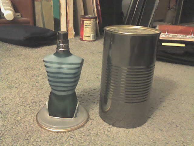
This is my boyfriends favorite cologne, Jean Paul Gaultier's
"Le Male", I thought the package design for this product was very one
of a kind. The cologne itself is packaged as a torso figure of a man,
adding the effect of stripes makes it seem as if the bottle is wearing
a shirt. The package for the bottle is just a plain tin can, retro
fitted with a removable base/lid of the can with a plastic inset to
hold the bottle in place. I thought this was an amazing package design
for what is really was. But when thinking of seeing this on a shelf at
a store, the can, or outside packaging, does notdisplay the name of the cologne prominently enough for someone who doesn't know Jean Paul Gaultire's cologne. The name itself is embossed into the can and there is no other color placed onto it to increase the awareness of the name of the product. If I was a consumer searching for the perfect cologne for a christmas gift I would not think to try this one if it was closed up in its package, I would want to see it merchandised apart like I have it shown in the picture.
1 comment:
Here we go. Fashion, my forte! This design fits Jean Paul Gaultier to a tee. He's a little insane, but in the artistic way, like there's this great trench he designed that I would love...getting off topic. Anyway, perfume always has the most innovative designs and this is super high fashion. You're right when you say it wouldn't stand out on the shelf though, but it fits for the fashion-oriented audience. The female version of this perfume is the same thing, but much more shiny, so the male version, with the dirtier can fits well.
Post a Comment