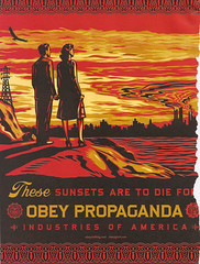
I am a big fan all around on "Obey". I love the message as well as the layout of this piece. It is eye catching. The boarder around the layout is very different than most advertisements that you see, most have no boarders at all. The way that he writes "these" is especially interesting. One can definitely note, in my opinion, the cynicism towards "America" and the world around us.
Sunday, October 21, 2007
Subscribe to:
Post Comments (Atom)

2 comments:
The illustration is very eye-catching. I also like the layout and border, but I'm not sure I like the way 'these' stands out so much, I know it was intentional but I think a different typeface might have been more effective.
I agree, I believe that a different typeface or color would have made the text stand out more. Reminds me of some thing you'd see in emigre magazine back in the day.
Post a Comment