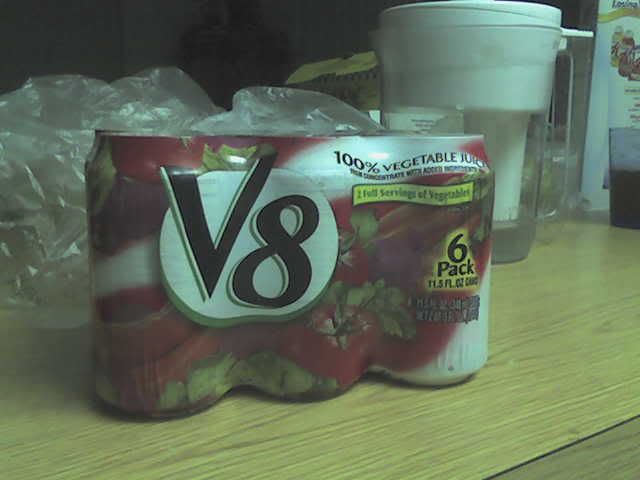
So I have recently discovered that V8 now comes in cans!! I bought this today grocery shopping and I totally had to have it. The shrink wrap is what suckered me into it. I really like that they used the shrink wrap instead of a box or those plastic rings, it looks very slender.I would think they were marketing to women from how shapely the packaging is. It has a very clean design and holds 6 cans. The white stands out on the shelves around all the other red tomato juice labels in the area. It also is the only canned tomato juice available from what I saw. The typefaces are used very well also, not too tacky. I really don't even mind the semi-outline on the V8 logo. Maybe the packaging will entice others to drink more V8!
1 comment:
I don't like V8 Splash. But that design is cool. I like how they have the plastic wrap as with the cans.
Post a Comment