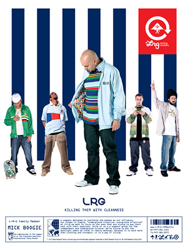
This is an ad for one of my favorite companies. I like the use of navy stripes with the red logo. The model in the front has a striped shirt on that is different colors and opposite stripes than the background, which is goes against traditional design but really catches the eye and works!
Wednesday, November 28, 2007
Subscribe to:
Post Comments (Atom)

1 comment:
This is an ill layout. I don't like all LRG ads. But every now and then they put it together really nicely. I like the printed text with the logos at the bottom.
Post a Comment