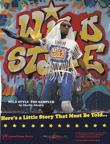
I saw this movie, which is from the eighties, many times. I like how this layout captures the film. I like how the text is going uphill but everything else is straight. Its a great idea to have the title behind the dancer, but in full view, smaller, on his shirt.
Monday, November 5, 2007
Subscribe to:
Post Comments (Atom)

No comments:
Post a Comment