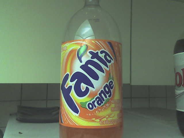
AH, FANTA! Well, I do not drink soda and I would not buy this cr*p :) even if it was the last thing to drink on the planet (this is my roommates junk). The package design for this beverage is way too overwhelming for me. Too much sun bursting and crazy type that's too busy. I understand it's Orange soda, but they could have used another color besides completely using orange! I can tell its orange just from seeing the soda through the bottle. I also don't like how the fanta is placed on the bottle, it makes you read it the wrong way, very uncomfortable. I have seen much better designs from generic orange sodas then this one. Their choice for a typeface is daunting as well, very bloated looking.
2 comments:
I don't have a problem with this label, but I agree with you on the bright orange. We are able to see the orange through the bottle some maybe some other color would help contrast it. I don't mind the bloated typeface or even having it slanted, I think it adds character.
"If you drink this you will get bloated." Ok, not really. It's a fun label, and different from most, but the slanted typeface makes me look at it sideways and my neck gets all cramped. Not fun.
Post a Comment