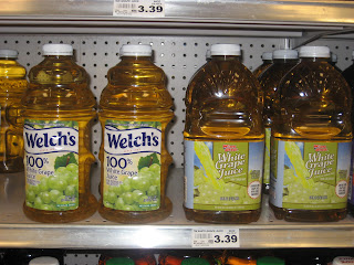
 I come to realize that Graphic Design is a very important job in the real wold. Some people may look at the product and the price and wonder why. Unlike other will admire the design and the package. In this case the design for Winn-Dixie is of course dredfull. Ok, it has its some good quality as far as the picture its QUITE alright. It seems like they was trying to mimic Welch's to a point as colors, but they fail in that aspect. The Winn-Dixie colors doesn't look delightfull to as Welch's colores. The picture in Welch's looks more natural to the Winn-Dixie graps that looks plastic.
P.S CALLIN ALL GRAPHIC DESIGNERS!!!!! CALLING ALL GRAPHIC DESIGNERS!!!!!!! Its just in Winn-Dixie just FIRED all there designers they are looking for new unique skillfull designer. That will put them up there with the brand name products. LOL!!!!!!!
3 comments:
I definitely think this is the best one for you to redesign. It just kills me that the juice is green too, when the juice is white? Very confusing.
You might want to read your entries and run spell check.
Yeah the waterfall of grape juice that looks like urine is awesome! LOL! Great job Winn Dixie!
Post a Comment