Thursday, April 10, 2008

JEAN L// FORM & SPACE.......... FEWHAKO


Above is an image of a sculpture that I saw on a webpage. It caught my attention immediately because of the style of character that was sculpted. In general, I enjoy pieces that have detail within the body’s structure. This sculpture has a lot of detail and the wood was carved to make a comic book character figure. The sculptor did a great job coloring the piece along with giving the anime character a dramatic tone to compliment the figure’s stance. As a drawing, this would be hard for most to pull off the right way. This figure was carved however and then painted on. That’s amazing to me. You can see how the light bounces off the deeper creases within the character’s suit. What I like the most is the choice of weapon, the way the pants looks like pants (as if they’re actually tighter in some areas), and the upper armor. It’s just a great demonstration of how an animation can be brought to life. You can even see the actual wood at the bottom where the paint fades. Crazy.
Tuesday, April 8, 2008

Form and Space Finds

Photobucket

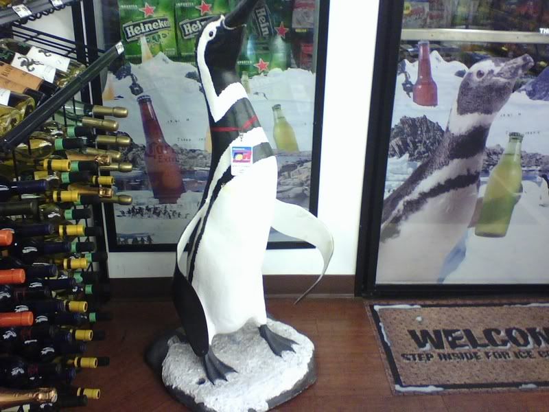
I came across this statue/ad in a conveinence store on my way home from school one evening. I thought it was an interesting way for them to try and promote selling alcohol considering that it is a statue of a penguin. Not many people would connect a statue of a penguin to drinking beer, so I'm not sure it is completely successful in that matter; However, the statue is placed right next to the freezer that is full of alcohol and it does grab your attention which would infact direct a customer to the freezer which would tempt that person to buy the product it was meant to sell.

Monday, April 7, 2008

Epcot ad

This ad for Epcot is simple and colorful. The large graphic and the small text balance each other out.


Thursday, March 20, 2008

Its a good simple ad. quick and easy to read. The gecko has become very familiar. Went and got some last month
I thought it was clever to advertize to the parents of todays children with something they may remember from their childhood. The ad itself is a little busy.
I used this image for the stipling project. I love the colors. Its not just an ad

Wednesday, March 19, 2008


the black border around the image with a thicker band of black on the right side with small white text makes a nice ad

the pepsi ad has an old feel to it, the font used makes you feel like you are looking at an old magazine

funny image, a basic magazine ad i would say, but the image shows it is about a car

the large image and band of white with the company logo on the bottom balances teh page out nicely.

The term pull some gees, is a play on words, with 2 meanings it makes the ad comical while the picture of the car beneath shows what 'pull some gees' is talking about.

this ad is so simplistic with the company name at the bottom. Image is cute

the coke ad is old fashioned and the way the t drips down to the coke glass serves as a sort of left band that off sets everything nicely.

Layout Design


ok what is neat about this Layout Design is that it is very simple but it does hold alot of imformation. i think that placing the text not in the boxes in an unexpected place was a bold but a smart move. becasue it isn't traditional but it works and make the product feel like that there isn't any other product out there like it

Layout Design


what really is interesting to me about this Layout Design is the way they used the fine print. instead of putting it on the bottom they puut it on the side top. i think that this ways smart becasue itnot only changes things up for the view but it makes you a little bit more interested in why they put it up therre and this then casue you to look at it when if it was at the bottom you already would know what it is and not even think about looking at it