Monday, April 28, 2008

absolut


this image grabbed my attention because of the contrast in colors, and i really like how the lemon grabs your attention and the "waves" move you down to the product information.

talib kweli flyer

This was a flyer given to me over the weekend, i really liked the choice of colors, and the way the text was laid out, without too many overwhelming graphics, the only thing that i would change are the wings behind the artist, they just seem out of place to me.

Sunday, April 27, 2008

Bless the Child


I think this image is funny and sweet at the same time because when I look closely I see a little girl holding her mother or sister in her arms. But, it's the most precious thing I have every seen.

Thursday, April 24, 2008

MINYAK // JEAN L // FORM AND SPACE


This is a sculpture that was designed by an artist on the concept art blog. I’ve always enjoyed the artwork of this group. This piece of work caught my eye because of its comic book-like features. It looks like something straight out of animation. Not only that but it’s also life-sized. The character itself “minyak” was inspired from an old folklore tale of an ugly creature who makes a deal with the devil to become good looking. But in order to become good-looking he must rape several virgins. The catch is, once he became good looking, every time the devil needed him to do his dirty work again he would turn him back into the same ugly disfigured creature again. I don’t know where this artist found such a tale, but he sure did a great job re-creating this character. The pieces were shaped and added rather than subtracted from a huge mold. He used thick wires for the skeleton of the piece. It looks like he used some sort of block putty or soft ceramic material.

Monday, April 21, 2008


I liked this image because in is very simple but creative. The 20 really draws you in and in seems to flow well

I found this image in a black and white computer art magazine and it picked it because its a really strong image but I don't think it detracts from the title.

Saturday, April 19, 2008

Layout Design- Snuggle ad


This ad stood out to me it is very playful and bright and the text goes well with the image.

Thursday, April 17, 2008

Form and Space


I came across this statue when I was in Ybor with some friends. It caught my eye first for it being a fountain and then I started to look at it for all the animals worked into it. The most interesting part about it is that the male mermaid is all covered up staring at the female mermaid who is full frontal. I just thought it was ironic. After starting at the statue, that first brought us from the street, we started to look at the school, Tampa University, it’s a nice tactic to bring people from the street to come look at the school.

Wednesday, April 16, 2008

"Good as Gold" by Donald Lipski

I found this photo last year when working on a project and have always enjoyed the nature of the piece. This sculpture is a display piece for the Kansas City libraries, and is a unique piece. Seemingly unsupported, this ring of books invites people into the library as they enter. I personally enjoy the composite nature of the ring, as it is comprised of a very diverse assortment of books, with a great range of shapes and sizes. It almost gives a since of movement as if a stack of books exploded in a circular fashion.

The original photographer linked the piece to the Stargate, as if it is a gate way into reading. While I agree with their sentiments, I find it to be much more interesting to look at then read. I personally think it would be interesting to see what books comprise the sculpture, possibly giving an insight into the personal views of the artist.

[ Click here or the photo for a larger version. ]
- Form & Space, Michael Blasdel

Tuesday, April 15, 2008

Blue Jean Cascade

Multitude of forms.
Repetition AND variation.
Gradient of denim color.
Texture - folds, creases - selling comfort.
Very subtle, small, white font allows for the boldness of the image.

Bumble Bee Princess


Fanciful. Imaginative. Vibrant. Adorable.

Bright color punch at center with text below and products at bottom creates good direction within the composition of the layout.

Interesting image cropping - with the head beyond the frame the figure becomes anonymous, an image for the consumer to try on.

Chris Cureton Post 02


Awesome comparison layout here. easy to read and follow. The title is nicely placed creating nice pyramid hierarchy.

Chris Cureton Post 01


I like how this layout uses the arrangement of the clock to represent time for the graphics and steps in the text.

Form and Space

Photobucket

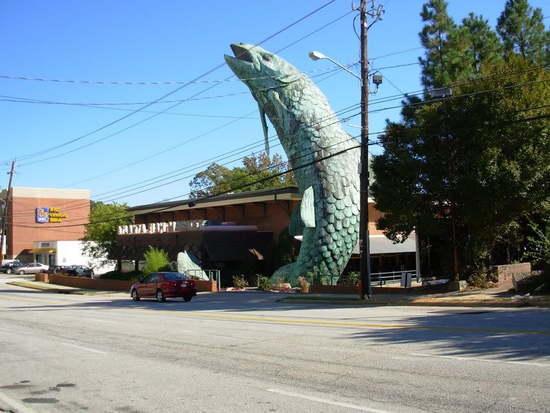
I found this while in Atlanta back in October. I thought it was strange to have such a big statue next to the building. The fish is actually made of steel and as you can see is very tall. I like how it curves to mimic a fish actually jumping out of water and the way they made it look very grungy works well with the statue.

Monday, April 14, 2008

Latin club flyer


i was handed out this flyer this weekend after a latin concert in orlando, i really dont like the way certain flyers are laid out just like this one with the different fonts, colors and hard to read information.