-Andrea Doric
Saturday, October 13, 2007
Layout Design Week 2 "Northwest"
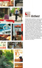
I chose this layout from many others because I like how it is minimal, yet there are many different photo's arranged together as if they were part of a puzzle. This is a neighborhood I lived in this summer, and I feel the way this piece is layed out, as well as the pictures they used, the small map, the title, and the text, truly represent the neighborhood well. I like how the text is NOT started in the dead center.
Subscribe to:
Post Comments (Atom)

1 comment:
I like this style layout. The colors are bright and the structure is really cool.
Post a Comment