Saturday, January 27, 2007
"Birth"
I thought the word “birth” would be easy to create, but as I started actually thinking of how to illustrate this I found it rather difficult. I started brainstorming and thought of things that were coming up, as if they were growing or rising. I thought of a flower or a plant that is rising up. I also thought of the usual things associated with birth, like a baby and a mother. Then I decided that I'd rather make something that was more abstract. I picture “birth” as being something that has action and life. I then thought of an egg. I drew an egg that has cracked open and things are flying up as if they are being born and reaching for the sky. I did not want to do the literal interpretation and put a chick hatching, so I added the symbols flying up to make it abstract to a point.
Weekly Product Analysis
As you can see in the picture, the cherries are located on the top shelf next to the “CherryMan” jar. The cherries are located on the shelf with all the ice cream toppings. The chocolate syrup containers are mostly shades of brown with not much contrast. The cherries actually stand out because of the red color. When I took a closer look at the two bottles of cherries, I noticed that the label on the “Cherryman” jar is actually transparent and the colors used are vibrant and childish. On the other hand, the label is very difficult to read and it’s rather dark. The “ThriftyMaid” brand is easily distinguishable among the rest of the jars on the shelf. If I were to redo the label on the ThriftyMaid jar I would like to change the color of the lid for starters, because the gold lid doesn’t work well with bright labels. I would also like to add some better design to it and make the label pop. The symmetrical design adds nothing “out of the ordinary” to the bottle. I would like to add something a little off balance on the label. It is actually not that badly done. It could just simply be better.
Friday, January 26, 2007
layout design week #3
This is a poster for an upcoming event. I like the arrangement and how the words are placed at an agle, but I'm not crazy about the big orange blob in the middle.
Special K
I snapped these while I was searching for Winn-Dixie products. They are placed near the bottom shelf, so I almost missed them, but that bright pink caught my attention. They are surrounded by Slim Fast and TLC and Atkins energy bars, but none of those products have the impact of bright colors working for them. The color is a little out of place, because all the other Special K products I saw weren't as colorful, but who knows. The only thing is that I wish there was a window so I could see the product. I have actually seen a bottle and it looks like plain water, but people might think it was actually that pink or yellow color. The product has a pretty clever name and the label "Protein Water" makes you think that it's ultra healthy, even though it dosen't have that much protein added to it. Certainly not enough to charge $7 for four bottles.
Thursday, January 25, 2007
Package Design & Thrifty Maid - ALERT
There has been some consternation about the Thrifty Maid Logo.
I do not want this to be an issue in the development of your label.
Therefore, make a gradient box with Thrifty Maid in a similar typeface and color.
I am looking at the overall label, not an accurate logo.
So provide a reasonable approximation.
Any questions? Email me.
T
I am available to review PDFs via email.
Thanks!
Week 3 Analysis
For week 3 I found a promotional CD case that I felt was a very good
design idea for promotional use. The slim container allows printing on the outside so
that any important information can be displayed like contact information. Also
sleekness of the container allows for easy portability so that it won’t be something that
people are automatically turned off too because of size. On the inside there is a
traditional CD clasp that holds the CD in place alleviating scratches and making noise.
The design in and of itself is not necessarily revolutionary; however, it is a good
concept for promotional items or software.
Layout Design -- Week3
So the first thing that bothered me about this ad is the fact that when you read it you see: kids 12 & under $2.99 eat from. It was poorly laid out to be read. They should have considered the fact that we, as american people, read from left to right and not zig-zag across your bright red and yellow ad-poster.
The rest of it was fine.. that just bugged the crap out of me.
-the beaver [miss tabitha]
Wednesday, January 24, 2007
Layout commentary
Tuesday, January 23, 2007
Layout - Week 2
Conceptual Imagery Weekly Spot Illustration week#2
I drew two pictures one of which has a humorous twist to it. The first one is exactly what came to mind when i think of hunger. I many times will be hungry already but then i will see an image on television showing a big gigantic juicey carl's jr. burger. It's usually those commercials that say "If it doesn't get all over the place, it doesn't belong in your face". Then im literally drooling and savilvating in hungry to the point where im grabbing my keys to get in the car and drive through. That is pretty much the first image illustrating what i feel like looking at their advertisements on television. The second one is a funny theme. The man is dyiing of thirst in the desert and the only water within site is the sewage water.
Thirst
Thirst
As I was thinking about this project, many things came to my mind when it came to the word “thirst”. I thought of water, the absence of water, dry mouth, an empty water tower, the desert. The desert idea seemed to attract me the most. As I brainstormed about the desert I naturally thought of camels. I thought it would be humorous to illustrate a thirsty camel, since they can go a long time without drinking water. As I was looking online for inspiration I got the idea of a camel in the desert jugging on a water bottle. The drawing is simple, nevertheless illustrates the topic of thirst.
-Natalie Mattox, Conceptual Imagery
Whenever I see someone who needs to rely on other people for basic necessities, it fills me with a lot of thoughts and feelings about the world and my own place in it. I wonder if we can stop this from happening somehow. I wish that the isolation that tends to follow poverty could end. Most of all, I think that as human beings, we're all entitled to a certain level of comfort in our lives and that too often random chance determines who will have that comfort and who won't.
Monday, January 22, 2007
Week 2 Analysis
Since I was slow on the whole you can use your Winn Dixie product as a weekly find, my Winn Dixie one will be for week 2. I chose to show the peanut butter because of how inmature I felt it was. Granted peanut butter is usually geared toward children, the random graphics on this label threw me off. Of course the gradiant was a horrible choice and the orbit surrounding the novelty typeface is just special. But what I thought was the most odd was the on both the crunchy and the creamy peanut butter bottles they had pictures of a group of peanuts. Most of the other competition showed a picture of what the bottle contained. Not that a graphic is necessary to show what is inside, however the same picture on two different products is not a good approach.
Dinner is Served!
Through this illustration, I wanted to express extreme hunger. It's similar to Thanksgiving after you've waited all day for dinner with the delicious smells drifting through the entire house. You're so hungry you just want to eat the whole turkey...which this girl definitely does. lol I wanted her to look funny and the turkey to be giantic to help exaggerate her hunger. Dinner is served!
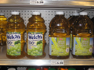
The Good vs. The Bad
I come to realize that Graphic Design is a very important job in the real wold. Some people may look at the product and the price and wonder why. Unlike other will admire the design and the package. In this case the design for Winn-Dixie is of course dredfull. Ok, it has its some good quality as far as the picture its QUITE alright. It seems like they was trying to mimic Welch's to a point as colors, but they fail in that aspect. The Winn-Dixie colors doesn't look delightfull to as Welch's colores. The picture in Welch's looks more natural to the Winn-Dixie graps that looks plastic.
P.S CALLIN ALL GRAPHIC DESIGNERS!!!!! CALLING ALL GRAPHIC DESIGNERS!!!!!!! Its just in Winn-Dixie just FIRED all there designers they are looking for new unique skillfull designer. That will put them up there with the brand name products. LOL!!!!!!!
Dutch Windmill
This photo was taken 0riginally to show the Dutch Windmill beer right above the enormous amount of Heineken cases. but when looking at the photo i could not stop looking at the Heineken light packaging. This really showed me how important looks are. The green is much more refreshing the red star draws you in, with a huge strong logo right upfront. From beginning to end they nailed it. And well Dutch Windmill is pushed to the side. The packaging is not horrible but it is certainly no match for the other green beers
Winn Dixie tomato sauce
Sweet Winn Dixie Tomato Sauce
I chose to talk about Winn Dixie’s tomato sauce. I half to say I am kind of impressed. They have a very good start. For the most part everything they had was rediculasly ugly. It’s also nice its placed next to all the Thrifty products, thrifty makes them look amazing. It’s pretty obvious that the buyer will choose Winn Dixie brand being that it is the same price, but looks much more tasty. The thrifty tomato sauce was one of my options for a re-design because they need help. The upside of thrifty is they keep everything the same. No matter what all the colors are the same everything is placed in the same spot. Though Winn Dixie has a strong tomato sauce package, the rest is not well put together. The fact that it is in a box makes it stand out even more.
Holy Bad Design Batman
First thing is that it's hard to see the actual label for it's the same color as the oil. The design has 4 different type faces, and not to mention the obvious radial gradient, I guess the rookie designer discovered a new tool and felt a need to integrate it with peauts and snow peas. There is no significant hierarchy with the text.
Thrifty Maid but not Equal
Here we have a box of Thrifty Maid sugar substitute with aspartame, otherwise known as generic Equal. Before I critique the design of the box itself, I must comment on the placement. I nearly missed this display in the grocery store because this one lonely row of blue Thrifty Maid sugar substitute boxes was camouflaged between many rows of Equal boxes.
That being said, it is not easy to decide where to start on the design of the box. When I first saw the box I was confused. Seeing the picture of the large iced tea pitcher along side the glass of iced tea, without any text, one would think the box was full of tea bags. The picture of the tea takes over the box, as apposed to the Equal advertising where the packet of Equal is the focal point. The layout of the box front is very square cold and uninviting. There are few if any curved lines. The curves I do see are in the logo.
That brings me to more bad news. The logo and the diagonal strips look like they’re from 1983. The logo badly needs to be updated and the strips eighty-sixed to fit the look of modern packaging. I’m sure there is more to critique on this box, however I do not have a picture of its backside.
-Natalie Mattox, Package Design
That being said, it is not easy to decide where to start on the design of the box. When I first saw the box I was confused. Seeing the picture of the large iced tea pitcher along side the glass of iced tea, without any text, one would think the box was full of tea bags. The picture of the tea takes over the box, as apposed to the Equal advertising where the packet of Equal is the focal point. The layout of the box front is very square cold and uninviting. There are few if any curved lines. The curves I do see are in the logo.
That brings me to more bad news. The logo and the diagonal strips look like they’re from 1983. The logo badly needs to be updated and the strips eighty-sixed to fit the look of modern packaging. I’m sure there is more to critique on this box, however I do not have a picture of its backside.
-Natalie Mattox, Package Design
Failure
What defines failure? How much money we don't have? I don't believe that. I believe that money can control your life and take control, thus leading to failure. That is what I tried to convey in this Illustration. A business man is handcuffed to money. Money controls his life. He has devoted his whole life to making money and is now consumed by it. He tries to escape the confines of his own success.
Hunger
Hunger
When I thought of hunger, I thought of poverty and the worst situation possible. The place with the most poverty right now, is probably Africa. Their children are starving and although efforts have been made to resolve the issue of starving children, hunger is still a huge and real problem. Therefore I chose to illustrate
a row of children possibly in an orphanage, waiting in line for food, holding their bowls out. The concept is striking and I tried to convey that with a striking image.
Weekly Analysis Week #3
Well, to start off, again the type
used on the thrifty maid brand has DROP SHADOWS! There are three
different typefaces used on the can. The logo itself has a horrible
stroked outline. As for the picture, I am not to sure as to whether the
ravioli is supposed to be on a plate or bowl. As mentioned before in
another post, my can has a gradient too. Instead of the gradient
running from top to the bottom, they decided to put a dark maroon border at
the bottom of the can where the gradient gets the lightest. The border
covers up part of the picture. Plus the small type on the border is stroked in black. There are horrible inconsistencies here. Compared to the Chef Boyarde brand, which has that POP factor, this can should be beaten with a blunt object and sent to the scratch n' dent aisle. Chef Boyarde utilizes white in their design, and only has a single ravioli on as the image showing the plump beef inside. Thrifty maid could learn a thing or two from the Chef!
Sunday, January 21, 2007
layout design week #2
Why do my eyes sting?
Pup-Peroni Dog Snacks
I understand why the designer made the color choices with this product. The bright Yellow on Red is craving to get your attention. This package of dog snacks will jump out of the shelf at you and scream "buy me buy me!" In that sense, it's successful. Unfortunately, it makes my eyes sting at the same time. It's like staring at the sun for too long. Ouch!
The fact is...it makes me nauseous! The color scheme is almost terrifying. Quite honestly, I don't think it's the packaging that gets people to buy them either...they're a hit because dogs actually do LOVE them, "A Pooch'll do Anything for Pup-Peroni Dog Snacks!" This is in fact true for most dogs. After some research I found that this snack is recommended for a training treat because dogs love them!
Major downfall is the color scheme. However, there is in fact a bright side! The package itself is actually pretty well made. It keeps the treats fresh and moist while protecting them from getting crushed (they resemble slim jims).
Perhaps their packaging is outdated? I tried finding some info on when Pup-Peroni's came out and what their package design was like then...but unfortunately, no luck. If anyone knows, I'd love to hear it!
layout design week #2
This is a promo poster for something that was going on at my church. Typically, the flyers they had out are usually really tacky and horribly constructed. This is the most tolerable that I've seen. There are actually some design elements in this piece and the color scheme is working well. I'm not crazy about the pictures, maybe they should have been in black and white or manipulated somehow, but overall the piece is good.
week#1 failure
Doesn't it always seem that car failure always occurs when things are already going bad? Or when you're already late? Car failure is a type of failure a lot of people have come in contact with. Whether it be your battery dying, your car overheating or your brakes failing you when the car in front of you comes to a complete stop.
I work at Steak n Shake and I always eat dinner a half hour before I go to work. But no matter how much I eat before I go, whenever I start serving food, I can't hold back the mouth watering. Whenever someone orders a burger dressed the way I would have it (cheese, lettuce, tomato, mayo), I look at it the whole way to the table. But whenever I get the food myself, it doesn't taste as good as it looks. I've worked there for over 5 years and I'm so incredibly tired of the food, but it looks so good.
dvd jacket
Week #2 Product Analysis
This Thrify Made can of spaghetti really gets me. I understand that they are trying to emphasize that there is spaghetti in the can, as opposed to…let’s say, peas but come on. The can is placed right next to Campbell’s spaghettios, which are full of life, excitement, and color. The ThrifyMade can has no chance.I also took a broader picture of this shelf and I noticed that the Campbell’s cans have mostly white with the illustrated picture of spaghetti, while all of the ThriftyMade cans are mostly red. I don’t think this is a problem, because red is a color that stands out to the eye. I think our problem here is the type, for one, which is aligned on the can with no jazz or emphasis. The Campbell’s can has type that pops out, along with the picture popping out. This can almost says “grab me”. While the ThriftyMade can says, “well, you can grab me if you want…but I’m really not that good.” Oh, I might also mention the beautiful gradient on the ThriftyMade can. Oh wait, did I say beautiful? Although we are not fond of gradients as graphic designers, there are still ways to make it work. I just believe that in this instance, the gradient from dark dark red to light red is too much of a contrast.
Week #2- Hunger
Ok, so how many times have you just been minding your own business walking down the street and out of nowhere, you hear this growling sound? You look to your side and see a gargantuous dog glaring you up and down. The dog is growling, holding a bone in his mouth, and drooling. So you think to yourself, “wow, if this dog doesn’t like the bone he’s about to chow down on, I think he’s going to chow down on me.” Come on now, this happens to you all the time, doesn’t it? Well, maybe it doesn’t. But it does explain my point for the reason I chose a dog with a bone in its mouth for the word “hunger”. He is guarding that bone with his life. He feels that if someone takes that bone, he will starve to death. This is what hunger is all about in my eyes.
Week #2 Spot Illustration ("thirst")
For "thirst" I drew a person trying to get that last drop of fluid out of the glass. I didn't color or shade anything except for the 2 little drops for emphasis that there was not much coming out of the glass but the person doesn't care because they are that thirsty. It shows that when someone is thristy they will do anything they can to quench it.
Week #1 Spot Illustration (success)
Subscribe to:
Posts (Atom)